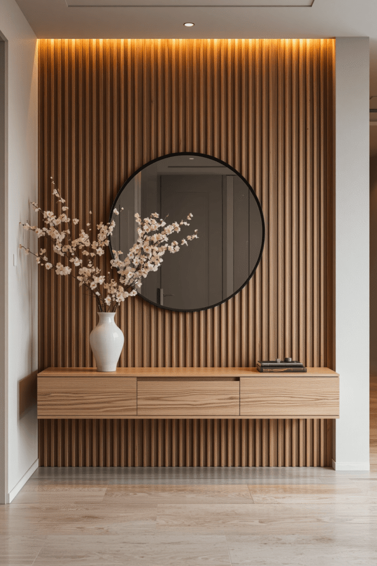
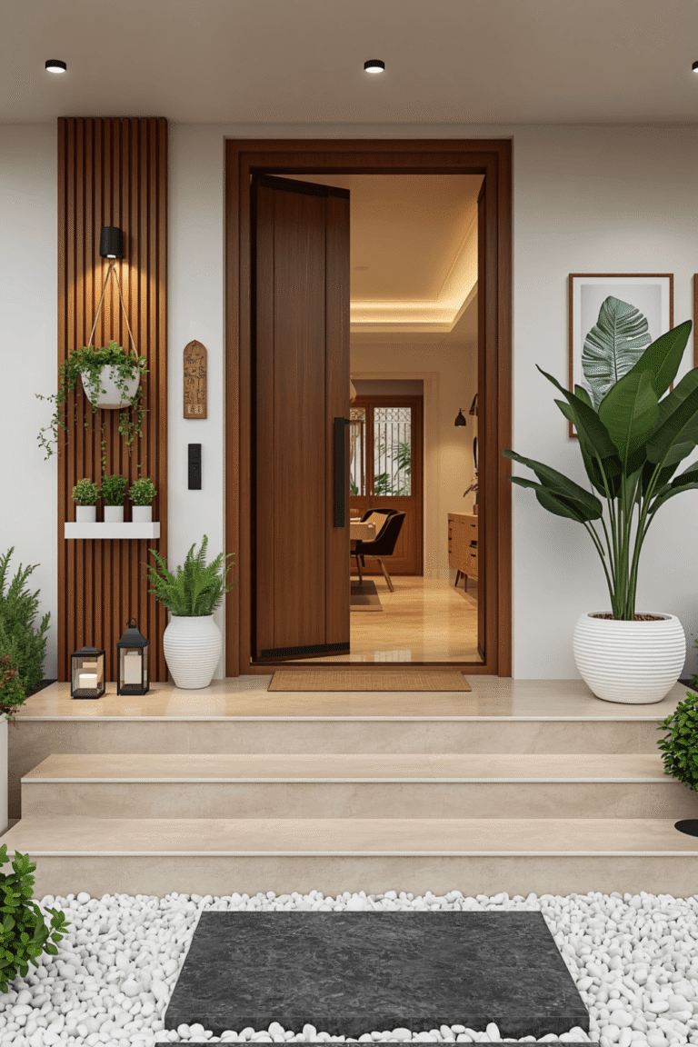
Pink Entryway Decor & Organic Mirror Ideas That Make Your Home Look Elegant
I painted my entryway a bright bubblegum pink after getting genuinely excited about adding some personality to that first small space guests see walking into my home. Once it was finished, it read as closer to a cotton candy stand than the chic, welcoming entrance I’d pictured. A friend actually laughed and asked if I was going for a candy shop theme, which was not exactly the vibe I was hoping for.
It took a repaint and some real rethinking about hardware, lighting, and surrounding materials before that same pink entryway finally felt elegant instead of overly sweet. Here’s what I learned making this notoriously tricky color actually work in a small, high-impact space.
Elegant Pink Requires a Completely Different Approach Than Playful Pink
My original mistake was choosing a bright, saturated pink because it felt fun and bold on the paint chip. What actually reads as elegant is a much more muted, dusty pink, closer to a blush or terracotta-pink tone than anything close to bubblegum or hot pink. That shift in undertone changes the entire feeling of the space.
Once I understood that distinction, repainting with a more sophisticated shade completely changed how the entryway read, without changing anything else about the layout.
My Mistake: Bright Pink Paired With Cool-Toned Chrome Hardware
Beyond the color itself, my original bright pink clashed with the polished chrome hooks and mirror frame I’d already installed, which pushed the whole look further into playful territory instead of sophisticated. Bright, saturated colors need careful hardware pairing, and cool chrome against bubblegum pink read as more juvenile than elegant.
I repainted the walls a muted dusty rose and switched to warm matte brass hardware instead of the polished chrome, and that combination read as intentional and elevated in a way my original pairing never managed.
Step-by-Step: Creating Pink Entryway Decor That Feels Elegant
1. Choose a muted, dusty shade over anything bright or saturated
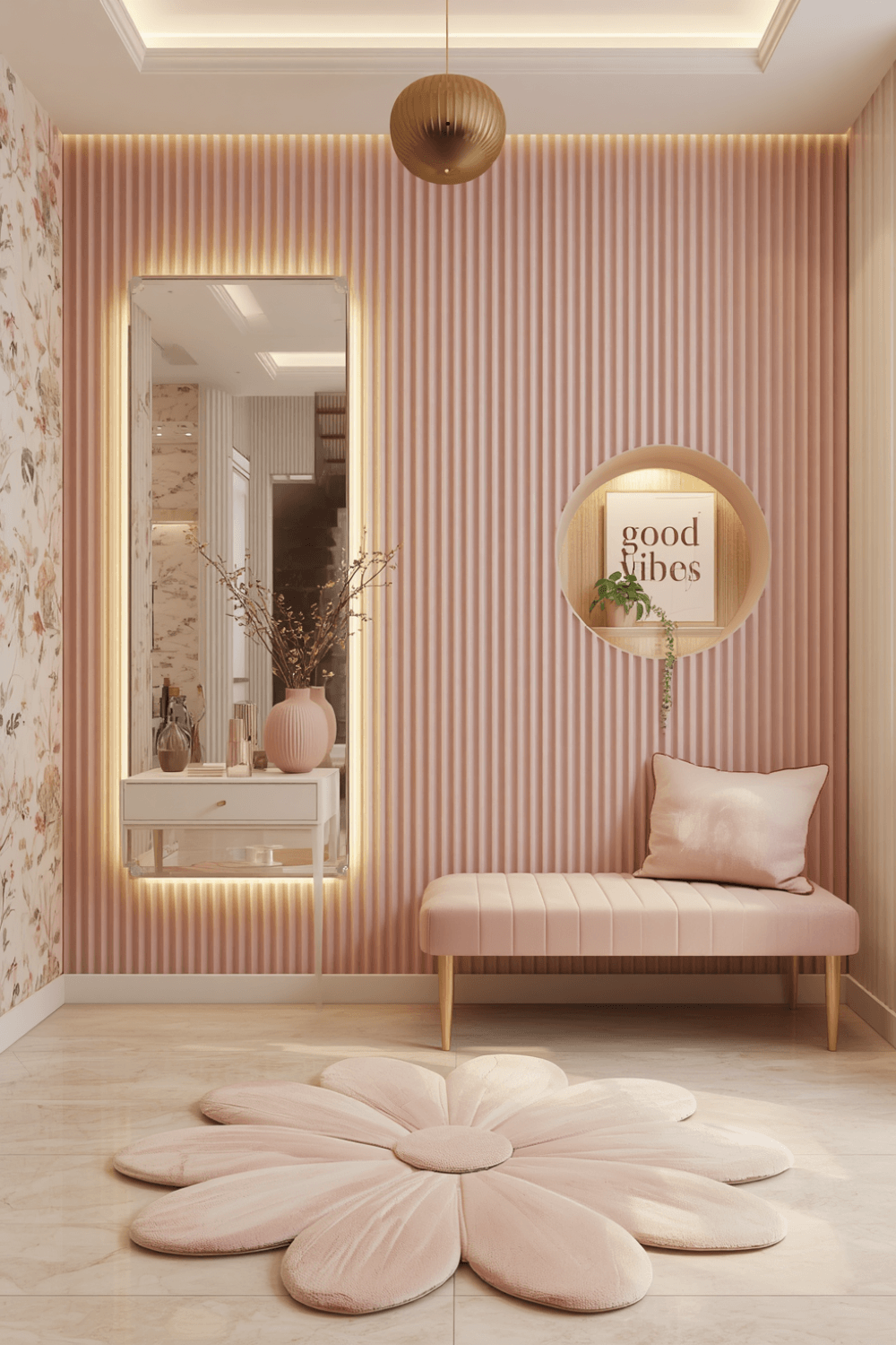
I now specifically look for pink shades described as dusty rose, terracotta-pink, or blush rather than anything labeled bubblegum or hot pink. These muted tones read as sophisticated regardless of what else is paired with them, while brighter shades need much more careful supporting choices to avoid looking overly sweet.
2. Match your hardware finish to the pink’s undertone
My dusty rose leans warm, so I chose a warm matte brass instead of cool polished chrome, which balanced rather than competed with the wall color. If your specific pink leans cooler, a cooler silver or brushed nickel finish might actually be the better pairing instead.
3. Use a matte or eggshell finish rather than high gloss
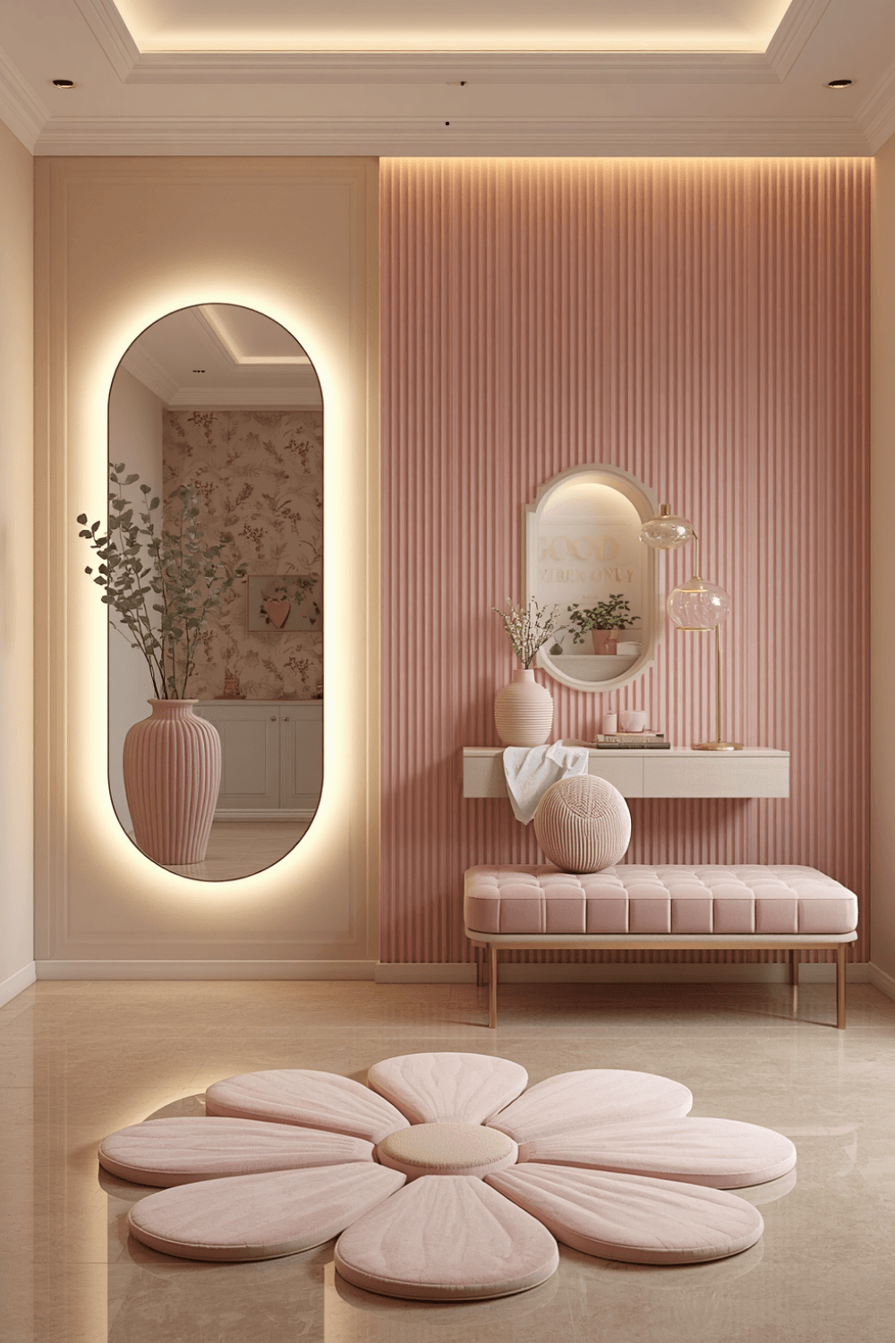
My original high gloss paint amplified how bright and almost plastic-looking the bubblegum pink appeared under my entryway lighting. Switching to a matte finish on my repaint softened the whole look considerably, giving it a more sophisticated, textural appearance rather than a shiny, toy-like one.
4. Balance the pink with plenty of neutral surrounding elements
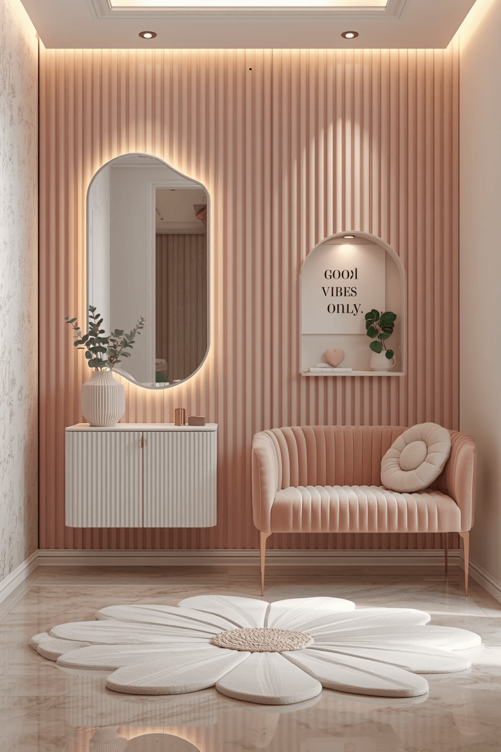
I kept my entryway console table and flooring in warm neutrals, a cream table and light wood floor, which let the wall color be the intentional pop rather than competing with an equally bold surrounding palette. Too much additional color elsewhere pushes a pink entryway from elegant statement into overwhelming.
5. Add warm layered lighting to enhance the elegant tone
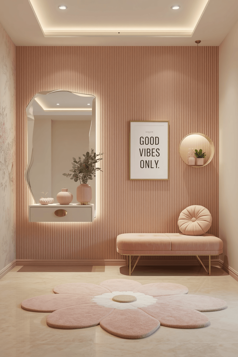
I added a small wall sconce beside my console table with a warm-toned bulb, which enhanced the dusty rose in a much more flattering way than the harsh overhead light I’d originally relied on. Warm lighting genuinely affects how sophisticated or garish a pink shade reads in person.
6. Layer in natural materials like wood or woven textures
I added a woven storage basket and a small wood tray for keys, which softened what could have otherwise felt like a slightly flat, one-note pink space. Natural texture keeps pink from feeling too precious or one-dimensional.
7. Keep decorative accents minimal and intentional
I limited my entryway decor to a single vase with seasonal branches instead of several smaller pink-adjacent accessories competing for attention. One well-chosen piece reads as more elevated than a cluster of items all trying to reinforce the same color theme at once.
Real Examples That Actually Work
A friend used an extremely muted, almost greige-leaning dusty pink for her entryway walls, paired with black hardware and a large black-framed mirror. The combination reads as genuinely sophisticated and surprisingly gender-neutral despite technically being a pink space, which she says surprises guests who expect something more overtly feminine.
Another friend went bolder with a deeper rose tone but balanced it heavily with black and brass detailing throughout, plus a patterned runner rug that pulled in both the pink and the darker accent tones. The richer shade worked specifically because of how much contrast surrounded it.
Common Mistakes to Avoid
Choosing a bright, saturated pink instead of a muted, dusty shade. Bright pinks need far more careful supporting choices to avoid reading as playful rather than elegant.
Pairing bright pink with cool, polished metal hardware. That combination tends to push the whole design further into candy-colored territory rather than sophisticated.
Using a high gloss finish on a bold pink shade. It amplifies the color’s intensity in a way that can look plastic or toy-like rather than elevated.
Surrounding the pink with equally bold colors elsewhere in the entryway. Too much competing color can overwhelm what should be an intentional statement in a small space.
Skipping natural texture and warm lighting. These small additions do significant work in elevating pink beyond what the paint color alone can achieve.
Final Thoughts
My pink entryway taught me that the difference between chic and childish really comes down to shade selection and how carefully everything else supports that color, not whether pink itself can look elegant in a small, high-impact space. The repaint to a muted dusty rose, combined with the hardware and lighting changes, completely transformed how the same basic idea read the moment someone walked through my door.
If you’re designing your own pink entryway, lean toward muted, dusty shades over anything bright, match your hardware finish carefully to the paint’s undertone, and don’t skip warm lighting or natural texture. That combination is really what separates a pink entryway that reads as elegant from one that feels more like a candy shop than a welcoming entrance.