Modern Wall Niche Design Real Styling and Lighting Tips
Modern Wall Niche Design: What I Learned After Mine Looked Like an Unfinished Hole in the Wall
When I had a recessed wall niche built into my living room during a renovation, I pictured something that would look like a sleek, gallery-style display feature. For the first several months after it was finished, it just looked like an oddly shaped gap in the wall with a couple of random items shoved inside, not exactly the polished feature I’d imagined paying extra for.
It took some real trial and error with lighting, styling, and even paint before that same niche finally looked like the intentional architectural feature it was supposed to be. Here’s what I learned turning an empty recessed space into something that actually looks designed.
A Niche Needs More Design Attention Than a Regular Shelf
I initially treated my wall niche like any other shelving situation, just put some decor in it and call it done. What I learned is that a recessed niche actually needs more intentional design consideration than open shelving, specifically because its enclosed shape draws more visual attention to whatever is or isn’t happening inside it.
Once I started treating the niche as its own small design project rather than an afterthought spot for random decor, the difference was significant.
My Mistake: No Lighting, Random Decor, Same Wall Color Throughout
My original niche had zero dedicated lighting, which left it looking dim and a little cave-like compared to the rest of the well-lit room. I’d also just placed whatever decor happened to be nearby into it, with no real cohesion, and painted the inside the exact same color as the surrounding wall, which made the whole feature blend in rather than stand out.
Adding dedicated lighting, painting the interior a contrasting tone, and actually curating what went inside transformed the niche from an awkward gap into a genuine focal point.
Step-by-Step: Designing a Modern Wall Niche That Actually Looks Intentional
1. Add dedicated lighting inside the niche
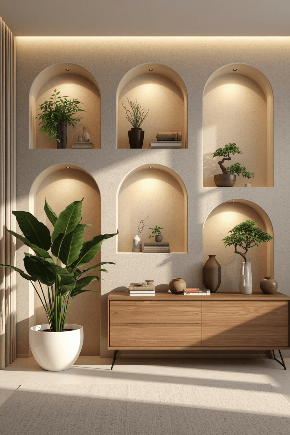 I installed a small LED strip light along the top interior edge of my niche, which completely changed how the space read. Without any dedicated lighting, even a beautifully designed niche can look flat and underwhelming, especially in the evening when the rest of the room relies on lamps and ambient light.
2. Paint the interior a contrasting color or finish
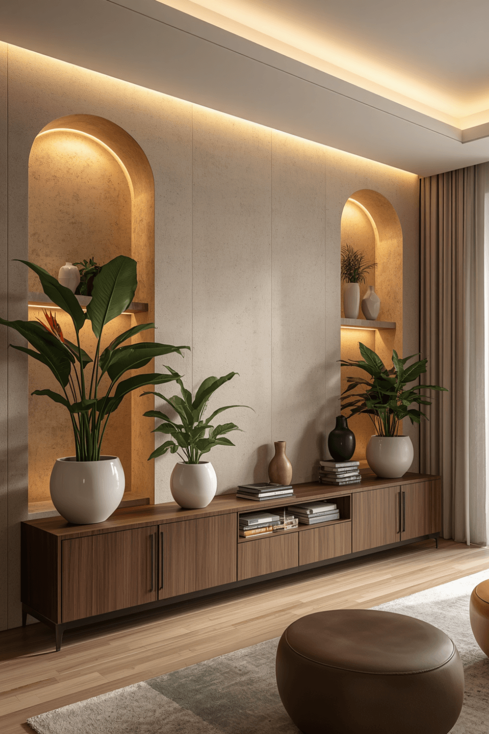 I painted the inside of my niche a deep charcoal, several shades darker than my main wall color, which created genuine depth and made the recessed shape read as an intentional architectural feature rather than something blending invisibly into the wall. Even a subtle tonal difference can make a real impact here.
3. Curate what goes inside rather than using it as random storage
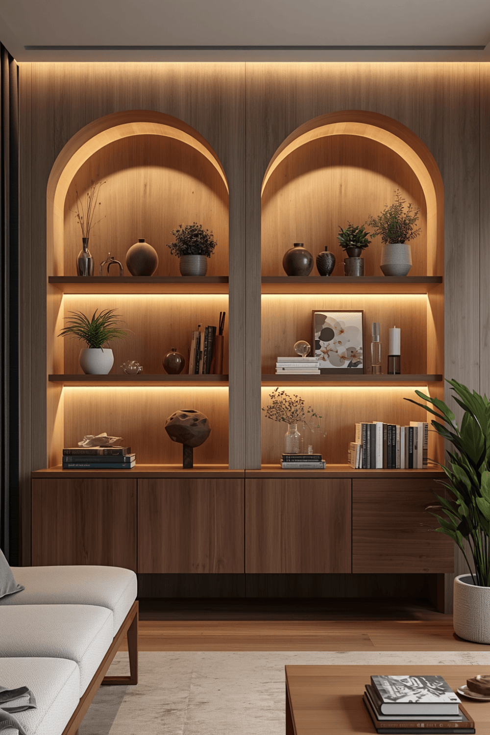 I removed several mismatched items I’d originally placed in the niche and replaced them with a smaller, more considered selection, one piece of art, a single sculptural object, and a small plant. Editing down to fewer, more intentional pieces read as far more designed than the cluttered assortment I started with.
4. Consider the niche’s proportions when choosing decor scale
My original decor items were too small for the niche’s actual size, which left it looking sparse and unfinished despite technically having things inside it. I sized up to slightly larger pieces that actually filled the space proportionally, which made a noticeable difference in how complete the whole niche looked.
5. Add a shelf if the niche is tall enough to benefit from one
I added a single floating shelf partway up my niche, which let me display items at two different heights instead of everything sitting at the same level on the floor of the recess. This is especially useful for taller niches that can otherwise feel like they have a lot of unused vertical space.
6. Use the niche to display something that changes seasonally
I now rotate what’s displayed in my niche a few times a year, swapping in different art or seasonal decor rather than treating it as a permanently fixed display. It keeps the feature feeling fresh and gives me a reason to actually pay attention to it instead of letting it become invisible background decor over time.
7. Match the niche’s finish to your room’s overall material palette
I made sure my niche’s interior finish coordinated with metals and materials already present elsewhere in the room, rather than introducing something completely unrelated. That consistency helps the niche feel like a natural extension of the room’s design rather than a separate, disconnected feature.
Real Examples From People I Know
A friend used her bedroom wall niche exclusively for a rotating book display, styled simply with just a small stack of books and one decorative bookend rather than trying to fill it with multiple types of objects. The simplicity and consistency of that single-purpose approach made the niche feel intentional every time she updated it.
Another friend added a mirror-backed niche in her hallway, which reflected light and made the whole recessed area feel deeper and more dramatic than the actual physical dimensions of the space. It’s a more involved design choice, but she says it’s become one of the most-commented-on details in her home.
Common Mistakes to Avoid
Leaving the niche with no dedicated lighting. Without it, even a well-proportioned niche can look flat and underwhelming, especially in the evening.
Using the same wall color inside the niche as the surrounding wall. It causes the feature to blend in rather than stand out as an intentional architectural element.
Filling the niche with mismatched, random items instead of curated decor. Fewer, more considered pieces almost always read as more designed than a cluttered assortment.
Choosing decor items too small for the niche’s actual proportions. It can leave an otherwise well-designed feature looking sparse and unfinished.
Treating the niche as permanent, unchanging display space. Rotating what’s inside periodically keeps the feature feeling fresh rather than fading into forgettable background decor.
Final Thoughts
My wall niche taught me that a recessed architectural feature needs more intentional design attention than regular open shelving, specifically because its enclosed shape makes both good and bad styling choices more noticeable. The lighting and contrasting paint alone transformed mine from an awkward gap into a genuine focal point in the room.
If you have your own wall niche to design, start with dedicated lighting and a contrasting interior finish before worrying about the decor itself. Those two changes alone solved most of what was making my niche look unfinished rather than intentional.