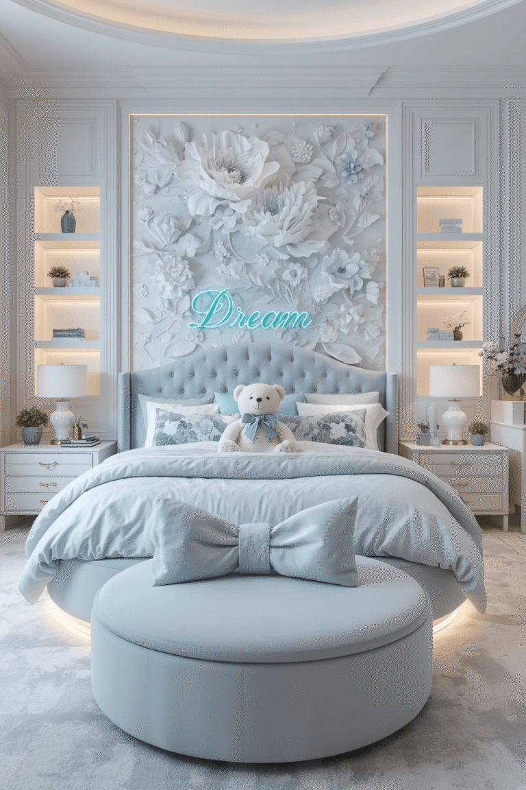
Luxury Pink Bedroom Ideas From Teenage Room to Elegant
Luxury Pink Bedroom Ideas: How I Stopped My Room Looking Like a Teenager’s
I’ve always loved pink, but for a long time I was scared to actually use it in my bedroom because every attempt I’d seen, including my own first try, ended up looking a little too sweet. My first version had a pale pink accent wall, a fluffy pink rug, and matching pink bedding, and honestly, it looked like something out of a teenager’s Pinterest board, not the elegant, grown-up room I was picturing.
I lived with that version for almost a year before finally figuring out what was actually going wrong. It wasn’t the color itself. It was everything I’d paired it with, or rather, hadn’t paired it with. Pink on its own, without the right supporting choices, tends to read as young. Pink layered thoughtfully can look genuinely luxurious.
If you love pink but are worried about it looking childish, here’s everything I learned actually pulling it off.
The Shade of Pink Matters More Than People Think
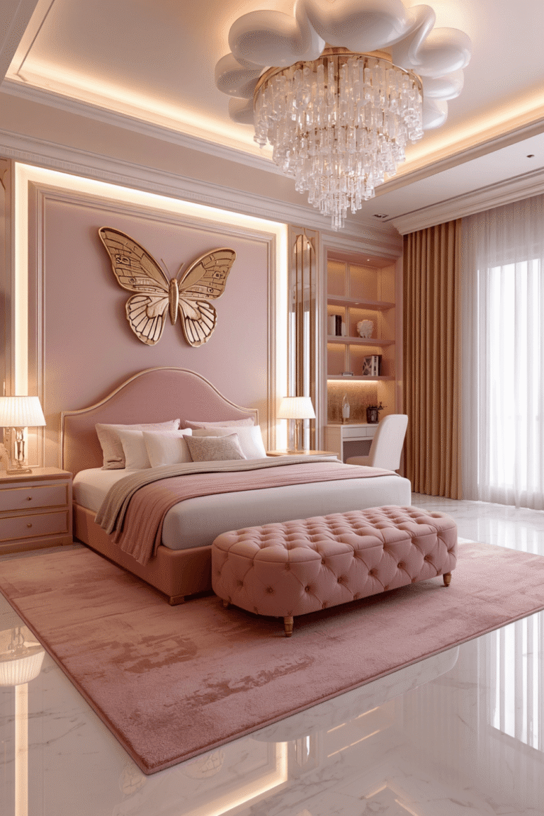
My first mistake was going with a very light, slightly cool-toned pink, almost a bubblegum shade under certain lighting. That particular tone is exactly what reads as young. Dustier, warmer pinks, think terracotta-adjacent rose or muted mauve tones, immediately look more sophisticated without losing the color entirely.
I ended up repainting to a dusty rose that leaned slightly toward mauve, and that single change did more heavy lifting than anything else I tried afterward.
Step-by-Step: How I Actually Made It Feel Luxurious
1. Choose a dustier, warmer pink over a pastel one
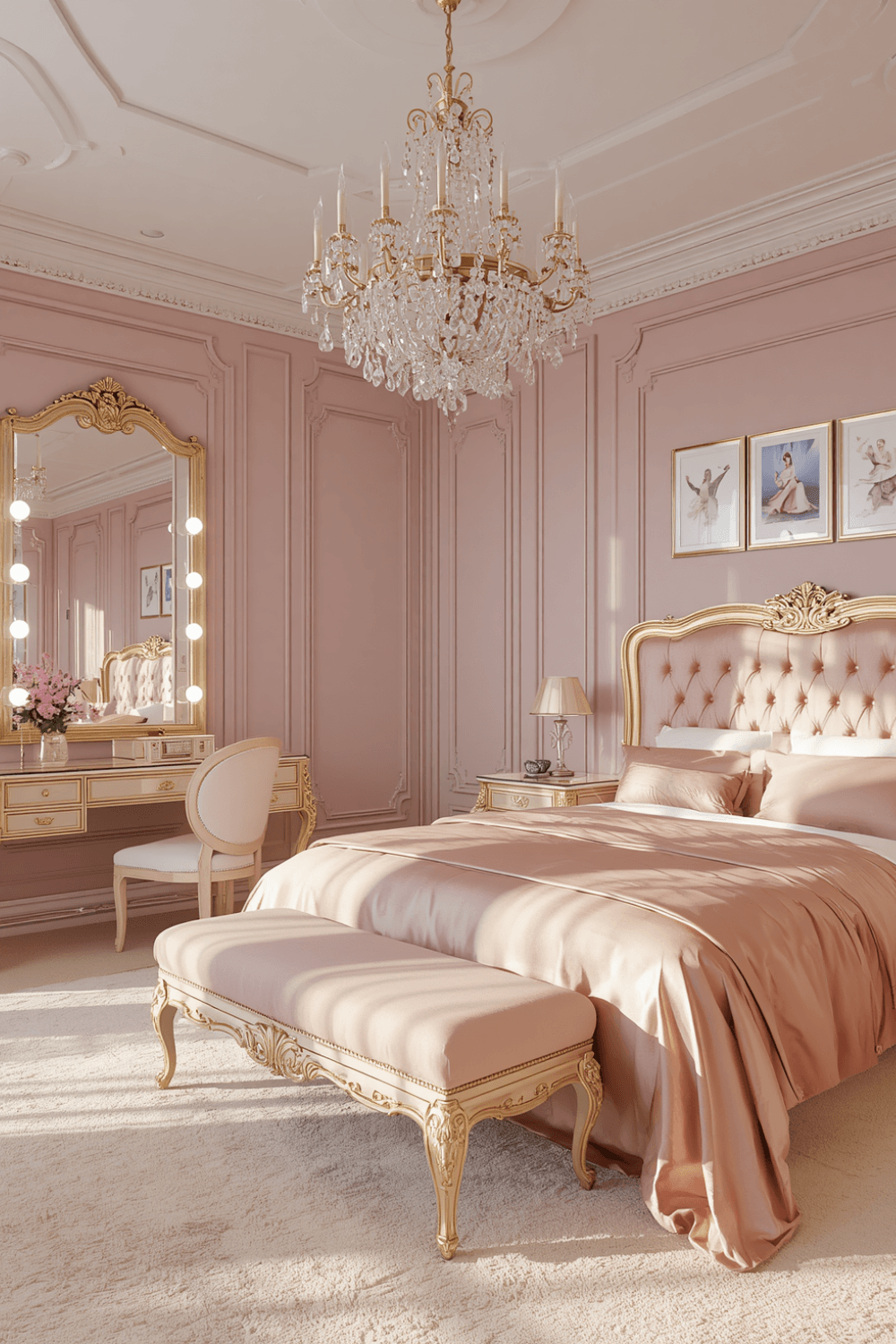
If you’re picking paint or bedding, hold the sample next to something you already consider elegant, a piece of wood furniture, a brass fixture, whatever you have. If the pink looks candy-like next to it, it’s probably too light or too cool-toned. Dustier shades with a hint of brown or mauve in them read as far more grown-up.
2. Pair pink with dark, moody tones instead of only pastels
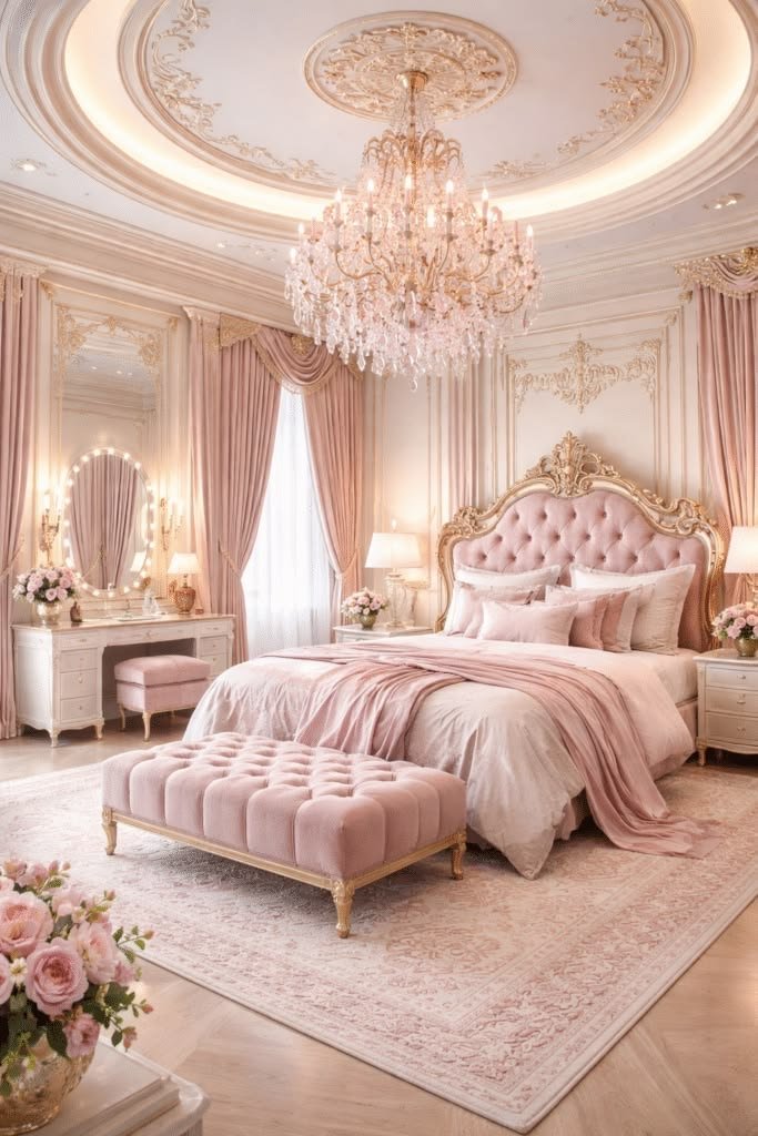
My original room paired pink with white and pale grey, which just intensified the “little girl” effect. I introduced a dark charcoal upholstered headboard and deep espresso wood nightstands, and the contrast completely changed how the pink read. Dark, grounding tones next to pink push it toward luxury instead of sweetness.
3. Use pink as an accent, not the whole room
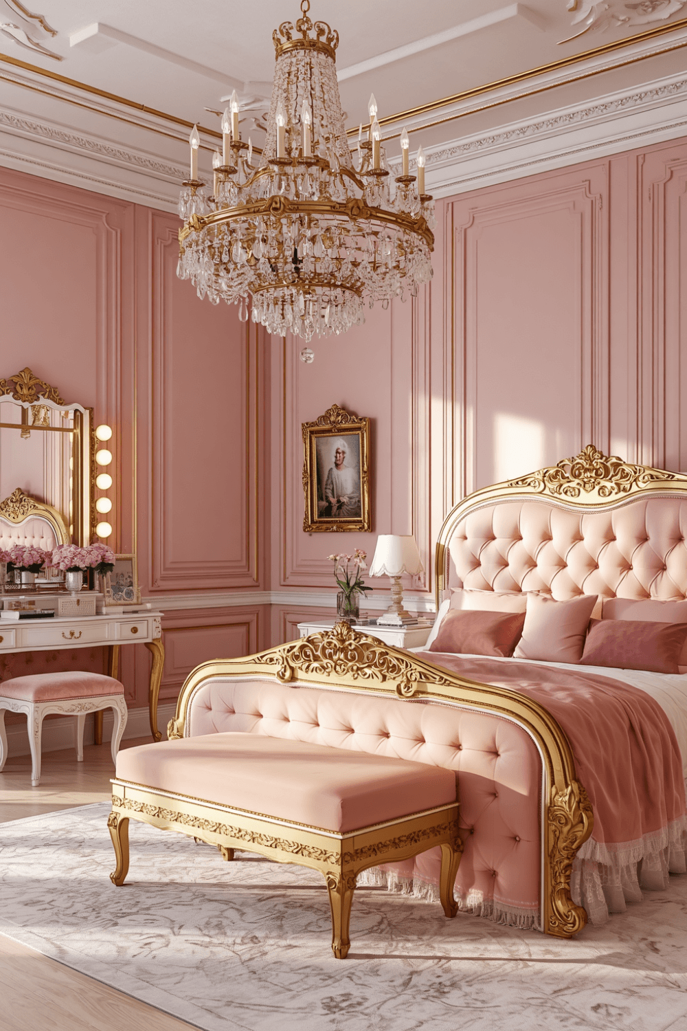
I originally had pink walls, pink bedding, and a pink rug all at once, which was genuinely too much of one thing. The redo kept the walls in a warm neutral and brought pink in through the bedding, one accent chair, and a few pillows instead. Pink works best as a strong supporting color, not the entire palette.
4. Add texture through velvet and silk-adjacent fabrics
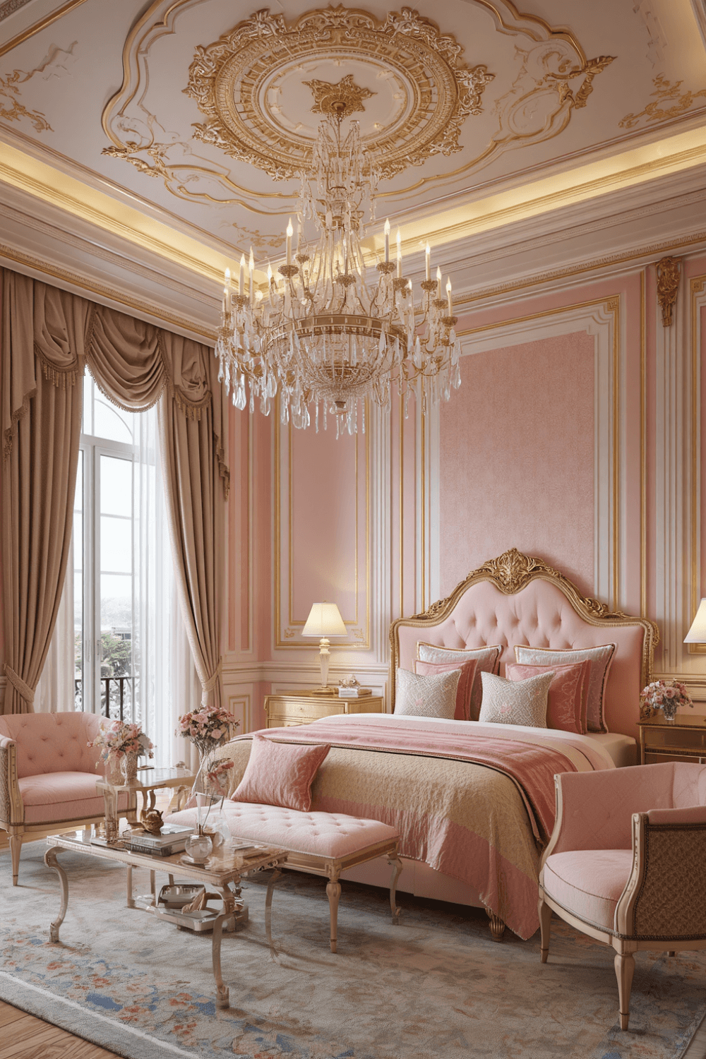
Cheap, shiny satin-style pink fabric is what pushed my original bedding into looking a bit juvenile. I switched to a velvet pink throw and one silk-blend lumbar pillow, and the difference in how “expensive” the room felt was honestly bigger than I expected from a fabric swap alone.
5. Bring in metallics, but keep them warm
Cool silver accents with pink amplified the coolness of my original palette in a way that didn’t help. I switched picture frames, a small tray on my dresser, and my lamp base to brushed brass and warm gold tones, which paired with the dustier pink much more naturally.
6. Layer in black or very dark accents somewhere
This felt counterintuitive at first, adding black to a pink room, but one black-framed mirror and a black metal reading lamp gave the whole space an edge that stopped it from feeling purely soft and sweet. A little contrast in a completely unexpected direction does a lot of work here.
7. Keep the lighting warm, not cool
Same lesson I’ve learned in basically every room in my house at this point: cool white bulbs make warm colors like pink look flatter and less rich. I switched every bulb in the room to warm white, around 2700K, and the dusty rose walls genuinely looked like a different, richer color after the swap.
A Real Example: My Bedroom Now
Right now my walls are a warm neutral, my bedding is dusty rose velvet with one silk-blend lumbar pillow, my headboard is dark charcoal upholstered fabric, my nightstands are espresso wood, and my accents (mirror frame, lamp, small tray) mix brushed brass with one black-framed piece. Total cost to redo it from the original “too sweet” version was around $650, mostly the bedding, headboard, and lighting swap.
It still reads as unmistakably pink, but nobody’s ever described it as a teenager’s room since the redo.
Common Mistakes to Avoid
Choosing a pastel, cool-toned pink. Light, candy-like pinks are the shades most likely to read as young. Dustier, warmer tones look far more mature.
Making pink the only color in the room. An entirely pink palette, walls, bedding, and rug all matching, tends to feel overwhelming and one-note. Use it as an accent against neutrals or darker tones instead.
Sticking with cheap, shiny fabrics. Satin-style pink fabric can look inexpensive fast. Velvet and richer textured fabrics elevate the same color significantly.
Pairing pink only with pastels and white. This combination amplifies the sweetness. Introducing dark, moody tones creates the contrast that reads as luxurious instead.
Using cool-toned metals. Silver and chrome next to pink can feel cold and slightly cheap. Warm metals like brass and gold pair much more naturally.
Ignoring lighting temperature. Cool white bulbs flatten warm colors. This is an easy, cheap fix that makes a bigger difference than most people expect.
Final Thoughts
Pink doesn’t have to look young or overly sweet in a bedroom, but it does need the right supporting choices around it, darker grounding tones, warmer metals, richer fabrics, and lighting that actually flatters the color instead of fighting it.
If your pink room currently feels more teenage bedroom than luxury retreat, the color probably isn’t the actual problem. Everything surrounding it usually is.