Luxury Pastel Living Room Ideas That Feel Elegant
Luxury Pastel Living Room Ideas: What I Learned After Mine Looked Like a Nursery Instead of Elegant
I mixed soft lavender, baby blue, and mint green throughout my living room, genuinely convinced that pairing multiple gentle pastels would feel dreamy and sophisticated. Instead, the combination read as distinctly childlike, closer to a nursery palette than the elegant, grown-up space I’d pictured. A friend actually asked if I was expecting, which was not exactly the reaction I was going for.
It took rethinking almost the entire palette and approach before pastels finally worked the way I’d originally imagined. Here’s what I learned about the real difference between a pastel room that feels sweet and one that feels genuinely luxurious.
Luxury Pastels Need Restraint That Nursery Pastels Don’t
My original mistake was treating pastels the way you might approach a baby’s room, mixing several soft, candy-like tones together without much editing. What actually reads as elevated is a much more disciplined approach, typically one or two pastels maximum, paired with sophisticated neutrals and materials rather than multiple soft colors competing for attention.
Once I understood that distinction, my redesign completely changed direction, and the room finally started reading as intentional rather than accidentally juvenile.
My Mistake: Too Many Pastels With No Grounding Neutral
My original room had lavender walls, a mint accent chair, and baby blue throw pillows, essentially every soft pastel I liked all represented at once with nothing to ground or balance them. Without any true neutral base, the whole space felt like a candy dish rather than a cohesive design.
I repainted to a warm greige, kept just one pastel, a muted dusty lavender, as my accent color, and added black and brass details for contrast. That editing down transformed the room from sweet and scattered into something genuinely sophisticated.
Step-by-Step: Creating a Luxury Pastel Living Room That Feels Elevated
1. Choose one primary pastel, not several competing tones
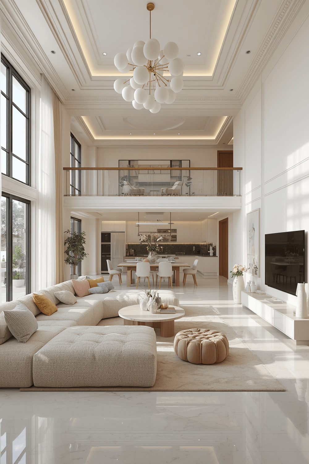 I now recommend committing to a single pastel as your accent color, used consistently through a few key pieces, rather than trying to incorporate every soft shade you like at once. One well-chosen pastel reads as intentional and elegant, while multiple pastels together tend to feel scattered and, frankly, a bit juvenile.
2. Ground the palette with a true neutral base
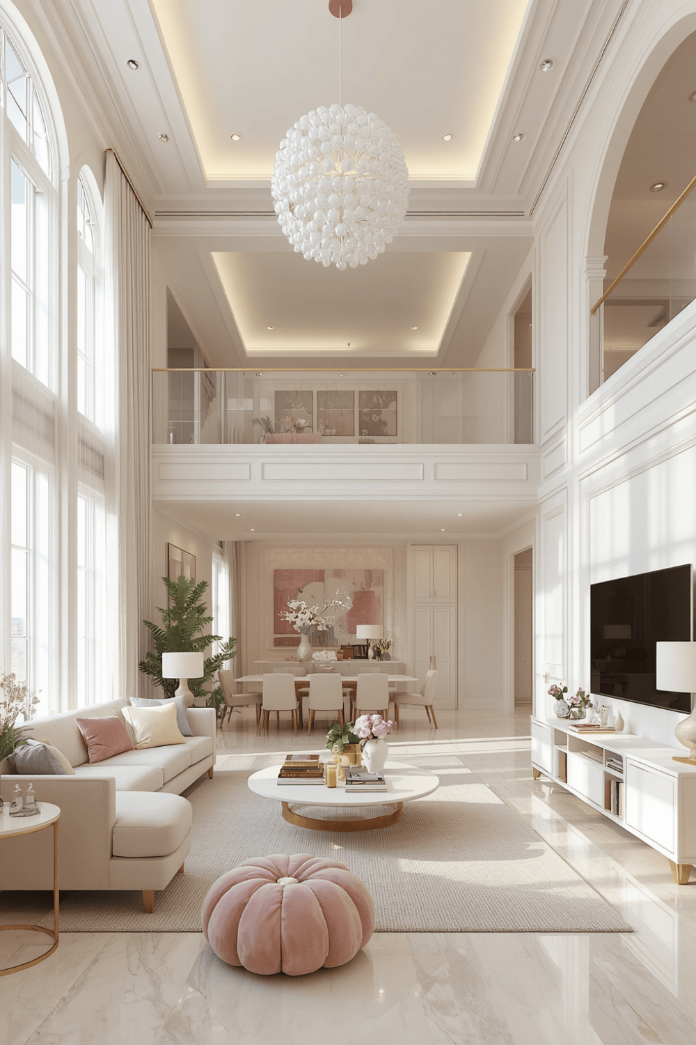 I switched my walls from lavender to a warm greige, which gave my single pastel accent something sophisticated to stand against. A neutral, grown-up base color throughout the majority of the room is genuinely what separates luxury pastel design from anything reading as overly sweet.
3. Add contrast through darker, structured elements
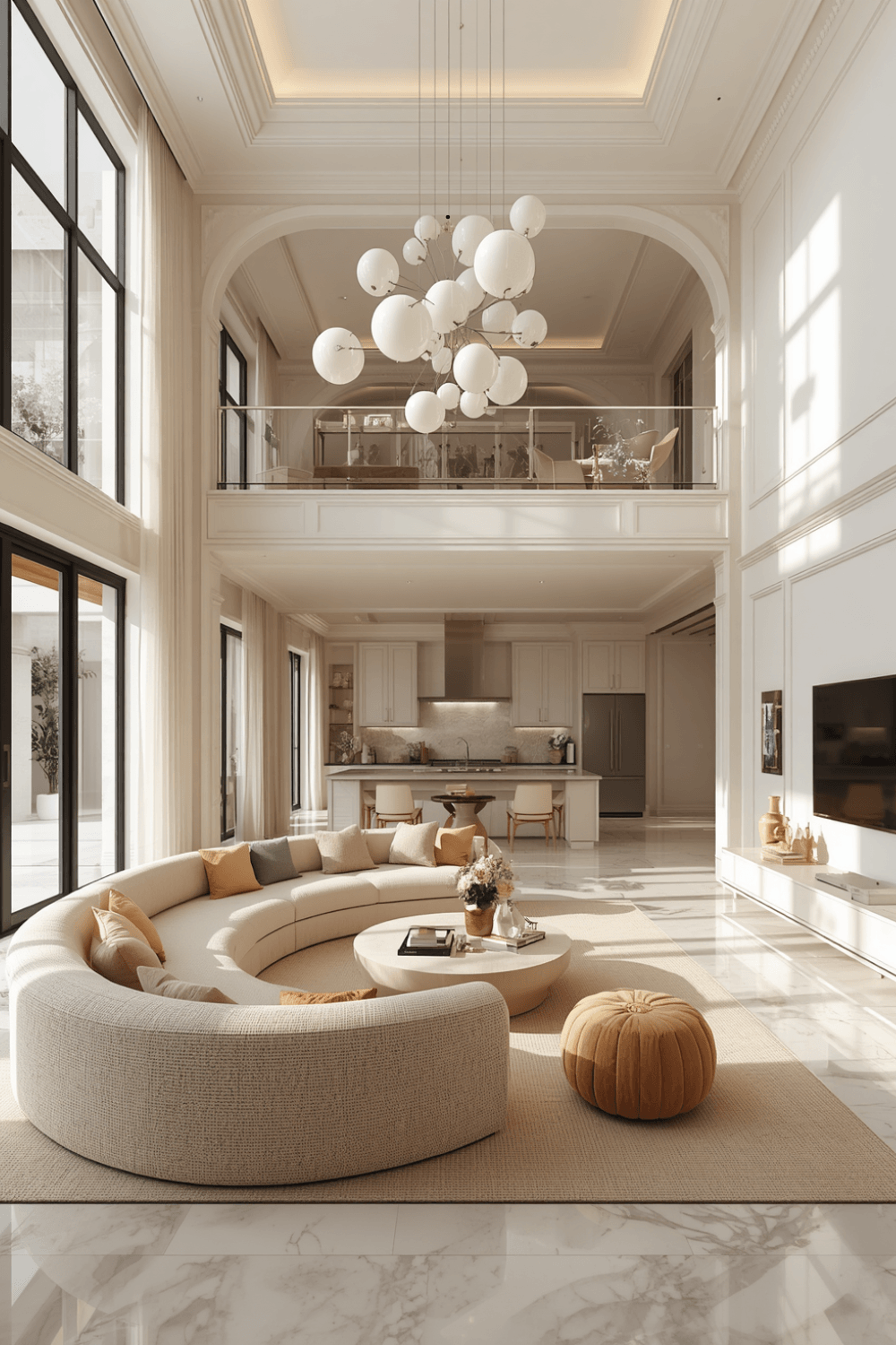 I added black picture frames, a black metal coffee table base, and dark bronze lamp bases throughout the room. That contrast against the softness of my pastel accent kept the whole space from tipping into overly delicate territory, giving the eye something crisp and grounded to rest on.
4. Choose muted, dusty versions of your pastel rather than bright, candy-like tones
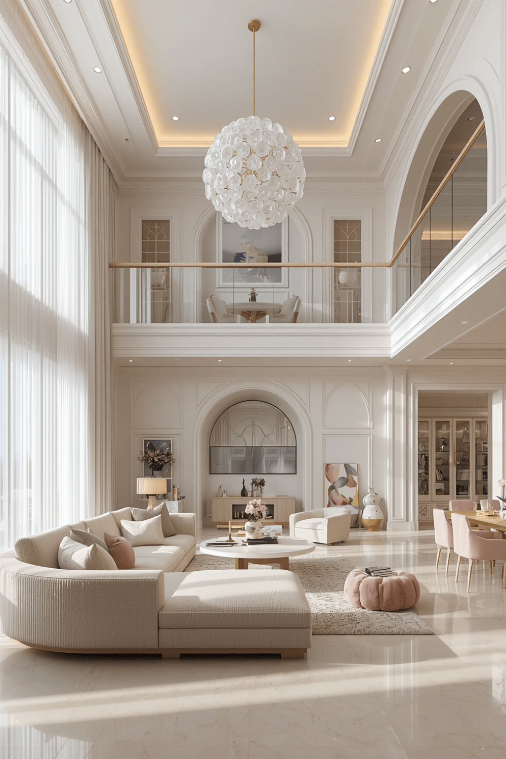 My original lavender was bright and almost artificial-looking. My replacement dusty lavender has more gray mixed into it, which reads as significantly more sophisticated under the same lighting. Muted pastels genuinely photograph and feel more luxurious than their brighter, more saturated counterparts.
5. Use your pastel in smaller doses through key accent pieces
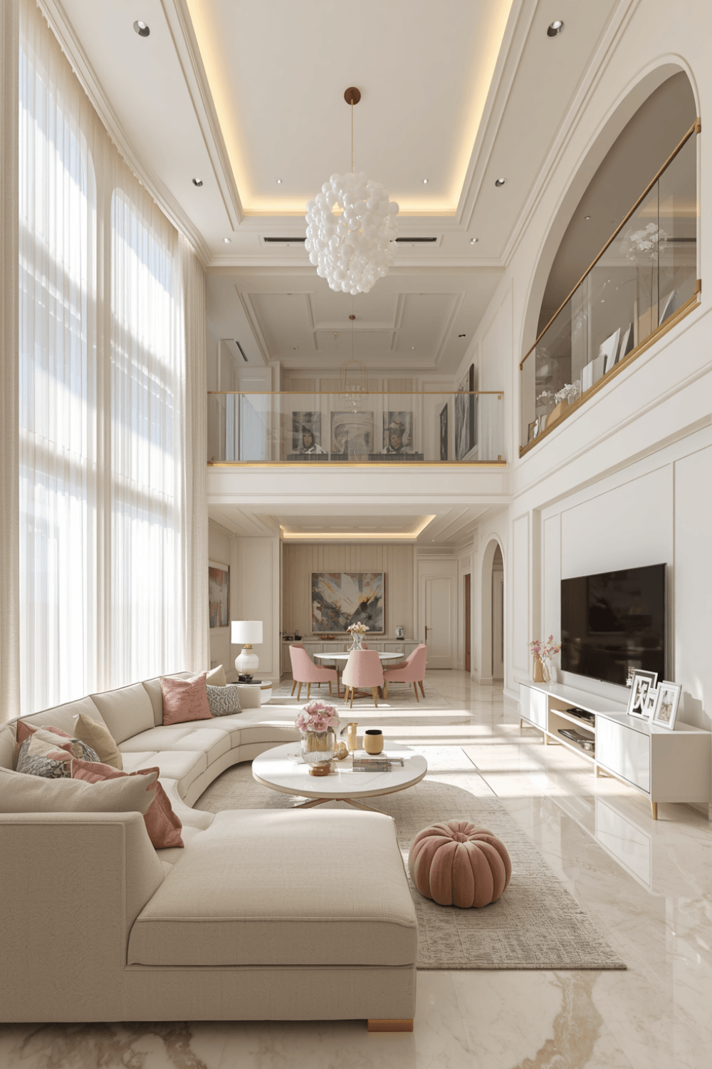 Rather than painting an entire wall, I now use my chosen pastel through a single accent chair, a few throw pillows, and one piece of art, letting neutral tones dominate the majority of the room. Smaller, more concentrated doses of pastel tend to read as more elegant than covering large surfaces entirely in the color.
6. Layer in metallics for polish alongside the soft palette
I added brass hardware on my media console and a gold-framed mirror, which introduced a sense of luxury and refinement that pastels alone can struggle to achieve. Metallics catch light in a way that elevates a soft palette without needing to add more competing colors.
7. Add texture through material variety instead of more pastel color
I layered in a bouclé pillow, a smooth velvet throw, and a natural jute rug, all in coordinating neutral tones rather than additional pastel shades. That tactile richness adds sophistication and depth without needing to lean further into the pastel palette itself.
Real Examples From People I Know
A friend committed to just one soft sage green as her pastel accent, paired with warm cream walls and extensive black and brass detailing throughout. Because she resisted the urge to add any additional pastel tones, her living room reads as genuinely elegant despite technically featuring a very soft, gentle color.
Another friend used a dusty blush pink in similarly small doses, just a single sofa and a couple of accent pieces, while keeping everything else neutral and structured. The restraint in how much of the pastel actually appeared in the room is what kept it from tipping into anything resembling a nursery palette.
Common Mistakes to Avoid
Mixing multiple pastel colors throughout the same room. A single, well-chosen pastel tends to read as far more sophisticated than trying to incorporate several soft shades at once.
Skipping a true neutral base for the majority of the room. Without grounding neutrals, an all-pastel palette often tips into overly sweet or juvenile territory.
Choosing bright, candy-like pastel shades over muted, dusty versions. The more muted a pastel is, the more elevated and sophisticated it tends to read.
Covering large surfaces entirely in pastel color. Smaller, more concentrated doses through key accent pieces generally look more elegant than an entire wall or large furniture piece in the same soft tone.
Forgetting contrast elements like black or metallic details. Structured, darker accents keep an otherwise soft palette from feeling too delicate or precious.
Final Thoughts
My living room taught me that luxury pastel design and nursery pastel design are genuinely different approaches, even when using similar base colors. The shift from multiple competing soft tones to one disciplined pastel accent, grounded by neutrals and contrast, completely changed how the same general color family read in the space.
If you’re designing your own luxury pastel living room, commit to just one soft color, ground it with true neutrals, and add contrast through darker or metallic details. That combination is really what separates a genuinely elevated pastel space from one that reads as sweet rather than sophisticated.