Luxury Blue Bedroom Ideas That Make Your Home Look Elegant & Expensive
Luxury Blue Bedroom Ideas: What I Learned Going Dark and Moody (Then Pulling It Back a Little)
I painted my bedroom navy blue on a whim after seeing one gorgeous hotel room photo online, and by the time I finished the second coat, the room felt more like a cave than the calming, luxurious retreat I’d imagined. Too dark, too heavy, and honestly a little depressing on a cloudy morning.
It took some real adjusting — not a full repaint, thankfully, but some genuinely important tweaks — before that same navy blue room became one of my favorite spaces in the house. If you’re drawn to a moody blue bedroom but nervous about it going wrong the way mine almost did, here’s everything that actually made the difference.
Why Blue Works So Well for a Luxury Bedroom Feel
Blue has this natural association with calm and depth, which is probably why so many high-end hotel rooms lean into navy, indigo, or deep slate tones for their bedrooms. It photographs beautifully and creates that cocoon-like feeling people associate with a really good night’s sleep.
The tricky part, which I learned the hard way, is that a dark saturated color like navy needs the right supporting elements around it, or it just reads as heavy and closed-in instead of luxurious and cozy.
My Mistake: All Dark Color, No Balance
My original plan was navy walls, navy bedding, and dark wood furniture, all in one go. I thought I was creating a cohesive, moody look. What I actually created was a room with almost zero contrast, where nothing had room to stand out and the whole space felt flat despite being visually “dark and interesting” on paper.
The fix wasn’t repainting — it was bringing in enough lighter and metallic elements to give the navy something to play off of, instead of surrounding it with more dark tones.
Step-by-Step: Creating a Luxury Blue Bedroom That Actually Works
1. Test your blue in your actual room lighting

I now always recommend buying a sample pot and painting a large poster-board swatch instead of committing straight to the wall. I move that swatch around my room throughout the day, because navy and deep blue shades can shift dramatically between morning and evening light, more than lighter colors typically do.
2. Balance dark walls with lighter bedding
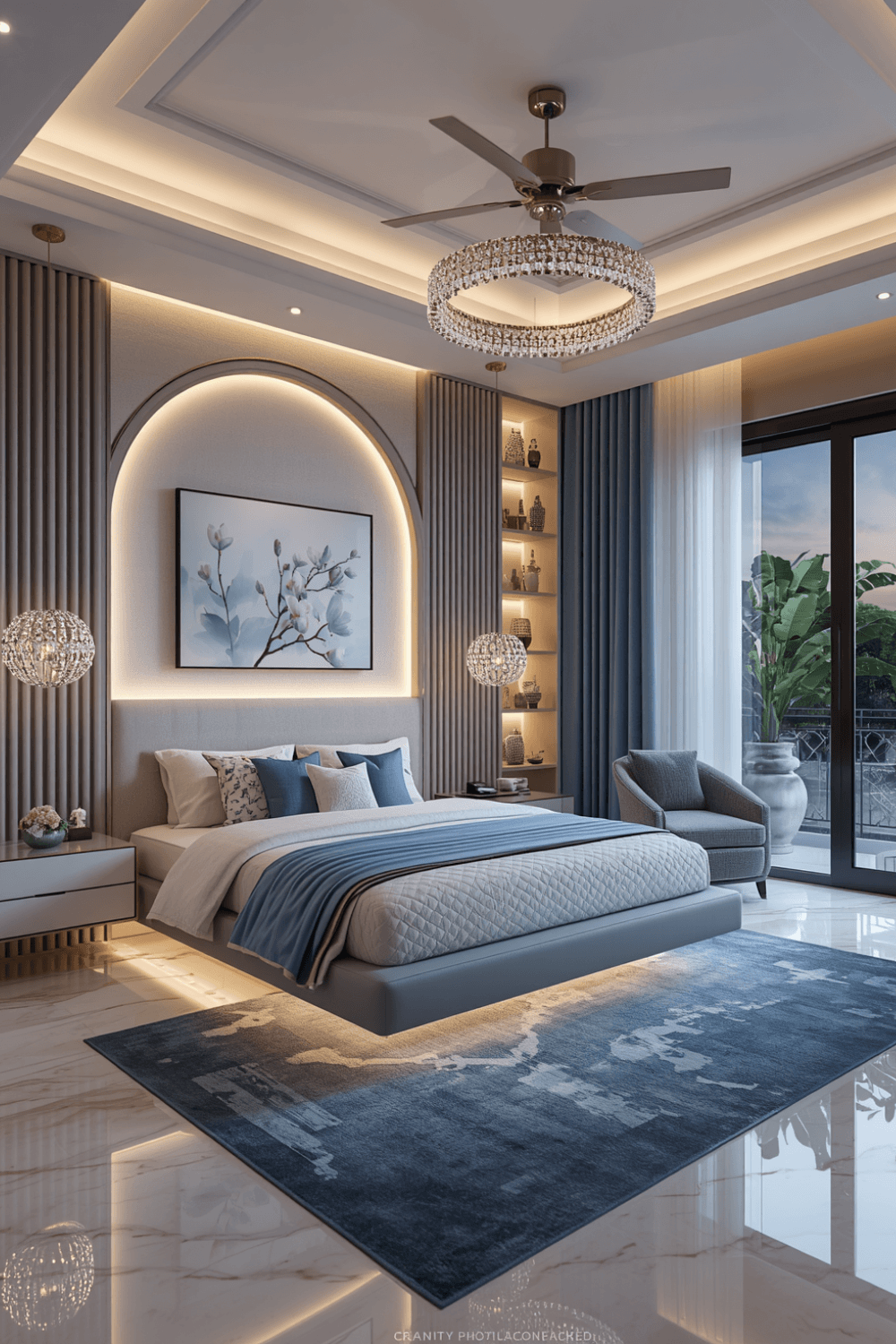
This was probably my single biggest fix. I swapped my originally planned navy comforter for a crisp white and cream duvet set instead. That contrast alone made the room feel intentional and layered instead of one heavy block of dark color.
3. Bring in metallics to add sparkle and warmth
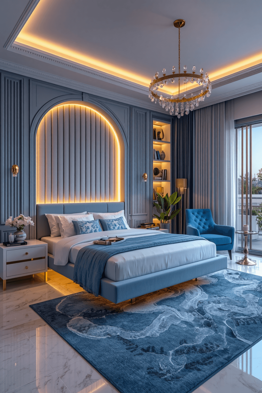
I added brushed gold hardware on my nightstands, a gold-framed mirror, and a small brass reading lamp. Metallics catch and reflect light in a way that keeps a dark room from feeling flat, and they’re a big part of why luxury hotel rooms manage to look moody without feeling gloomy.
4. Layer your lighting instead of relying on one source
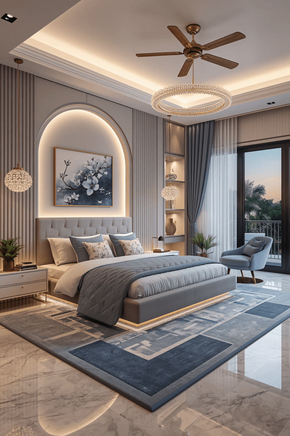 A single overhead fixture in a dark blue room creates harsh, uneven shadows. I added a dimmable bedside lamp on each nightstand and a floor lamp in the reading corner, which lets me adjust the mood depending on the time of day instead of fighting one flat light source.
5. Add texture through fabric, not just color
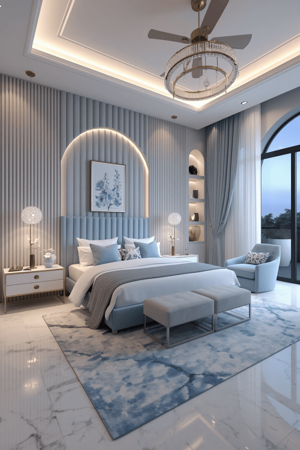
I introduced a chunky knit throw, a velvet accent chair, and a woven jute rug. Texture does a lot of the work that color alone can’t, especially in a room that’s mostly one deep shade. It keeps the eye interested without needing to add more color.
6. Keep your ceiling lighter if the room feels closed in
I kept my ceiling a soft white instead of continuing the navy all the way up, which made a noticeable difference in how tall and open the room felt. A full dark box, ceiling included, can feel oppressive fast in a smaller bedroom.
7. Add one warm wood element to soften the coolness
Blue is a cool color, and an all-blue-and-white room can start to feel a little sterile despite the coziness of the shade itself. I added a mid-century walnut dresser, and the warm wood tone balanced the coolness of the navy in a way white alone couldn’t.
Real Examples From People I Know
A friend did a smaller guest bedroom in a lighter dusty blue instead of a deep navy, paired with white trim and brass accents, which gave a similar luxury feel without the heaviness a fully saturated dark color can bring into a smaller space.
Another friend went bold with a full navy room, including a navy upholstered headboard, but balanced it with a large cream area rug, white linen curtains, and gold sconces flanking the bed. The result reads as intentional and rich instead of overwhelming, mostly because of how much lighter material surrounds the dark color.
Common Mistakes to Avoid
Pairing dark walls with dark bedding and furniture all at once. Without contrast, the whole room can feel flat and heavy instead of luxurious.
Skipping the lighting plan. Dark rooms need more intentional, layered lighting than lighter ones to avoid feeling gloomy.
Continuing the dark color onto the ceiling in a smaller room. It can make the space feel closed-in rather than cozy.
Ignoring texture. Fabric variety does a lot of visual work in a mostly one-color room and shouldn’t be an afterthought.
Going too dark without testing the shade first. Deep blues can shift more dramatically under different lighting than people expect from a paint chip alone.
Final Thoughts
My navy bedroom almost became a mistake I lived with out of stubbornness, but a few intentional adjustments — lighter bedding, metallics, layered lighting, and some warm wood — turned it into the calm, luxurious space I originally pictured. The color itself wasn’t the problem. The lack of balance around it was.
If you’re drawn to a deep blue bedroom, don’t be afraid of the color itself. Just make sure you’re planning for contrast, texture, and lighting alongside it, so the room ends up feeling rich and cozy instead of closed-in the way mine almost did.