20 Modern Neutral Living Room Ideas That Actually Work (2026)
Modern Neutral Living Room: What I Learned After Getting It Wrong Twice
I painted my living room “greige” three years ago because a Pinterest board told me to.
Big mistake. Not because greige is bad, but because I picked it without checking what my north-facing window does to a color by 4 PM. By winter, my “warm neutral” looked like wet cement. I sat on my couch one gray afternoon, looked around, and thought: this room has no personality, and somehow it’s also depressing. That’s the trap with neutral living rooms. People assume “neutral” means “safe,” slap on some off-white paint, buy a beige sofa, and call it modern. Then they wonder why the room feels like a waiting room at a dentist’s office.
I’ve since redone this room twice, helped two friends do theirs, and read way too many paint swatches under different light bulbs than any reasonable person should. Here’s what actually holds up.
Why Neutral Rooms Go Wrong (And It’s Rarely the Color)
Most flat, boring neutral rooms aren’t boring because of the palette. They’re boring because everything is the same tone with the same finish and zero contrast in texture.
Picture a beige wall, a beige sofa, a beige rug. Technically neutral. Visually a fog machine went off in your living room. Your eye has nowhere to land.
The rooms that actually feel modern and calm — not just empty — mix warm and cool neutrals, layer at least three different textures, and use black or dark wood somewhere to anchor the space. Without that anchor, a neutral room just drifts.
Step 1: Pick Your Undertone Before Anything Else
This is the part everyone skips, and it’s the part that ruined my first attempt.
Neutrals aren’t actually neutral. They lean warm (yellow, pink, peach undertones) or cool (blue, gray undertones). Grab a few sample pots — I like Behr and Sherwin-Williams for this because their sample sizes are cheap enough to waste — and paint a section of wall, not a swatch card. Swatch cards lie.
Watch it at 9 AM, at 2 PM, and after dark with your lamps on. My old greige looked fine in the morning and turned sad and gray by evening because my room barely gets afternoon sun. If your room is north-facing or gets limited direct light, lean warm. If it’s flooded with sun most of the day, cooler neutrals won’t wash out.
Step 2: Build the Base Layer
Once the wall color is locked in, the furniture foundation is next: sofa, rug, and any large case pieces.
Here’s a mistake I made and see constantly with clients too — buying the sofa and rug in the exact same shade of the wall. It disappears. Everything blends into one blob, and the room reads flat in photos and in person.
Instead, go one to two shades off from your wall in either direction. If your walls are warm oatmeal, a cooler stone-gray sofa gives just enough separation for your eye to register depth. IKEA’s Vimle and West Elm’s Haven are two sofas I’ve actually sat on (and slept on, during a move) that come in a decent range of true neutrals without leaning too yellow or too blue.
Step 3: Layer Texture Like You Mean It
This is the actual secret to modern neutral rooms not looking dead. Texture does the work that color usually does in a bolder room.
A few combos that have worked in my own space and in a friend’s apartment redo:
- Boucle or chunky-knit throw pillows against a smooth linen sofa
- A jute or wool rug under a glass or lacquered coffee table
- Woven rattan or wood accents against matte painted walls
- A velvet accent chair in the same neutral family as everything else, just with a different sheen
You don’t need five different materials. Three is usually enough to keep it from looking sterile without turning it into a texture showroom.
1. Layer Your Lighting
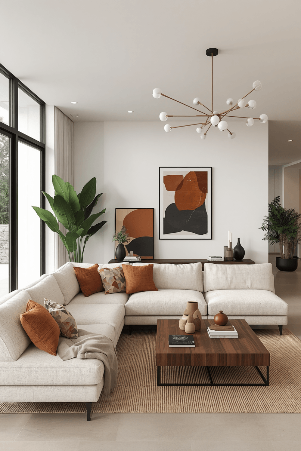 One overhead fixture in a neutral room is unforgiving. Add a floor lamp and a table lamp or two so there’s warmth at different heights in the room, not just from above.
2. Let One Unexpected Color In
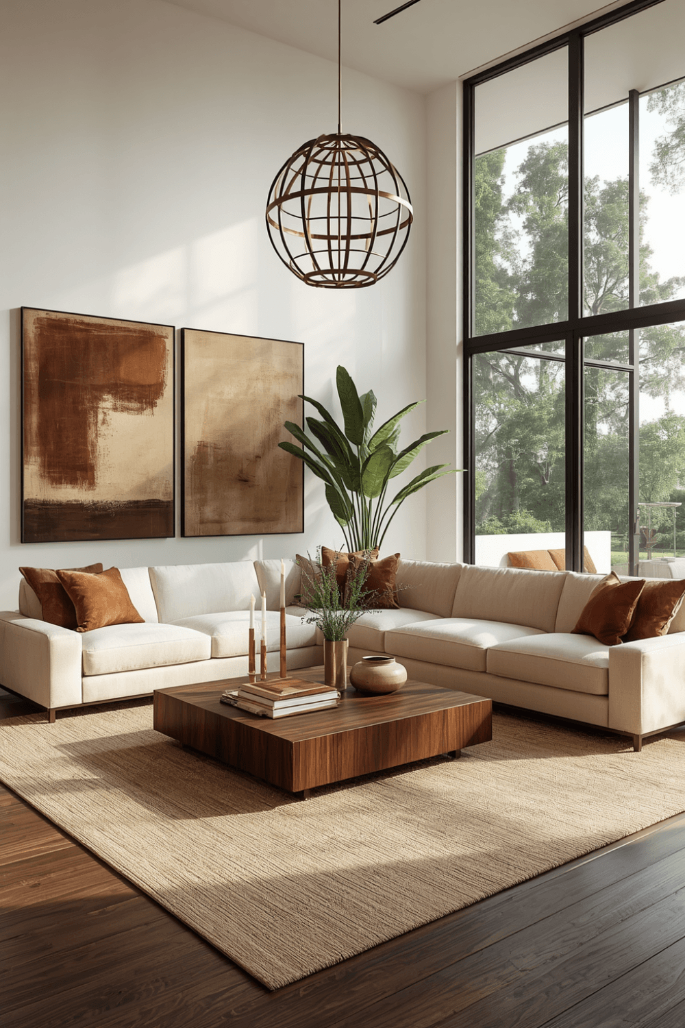 Neutral doesn’t mean colorless. A single mustard or terracotta pillow, one sage green vase, gives the eye somewhere to land and keeps the room from feeling like a hotel lobby.
3. Add Real or Faux Greenery
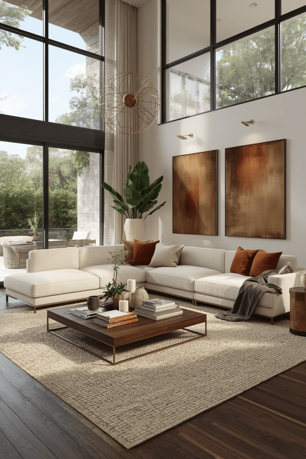
 A snake plant or a faux fiddle leaf fig introduces a shape and a shade of green that nothing else in a neutral room has. It’s a small addition that finishes the space.
4. Hang Sheer Linen Curtains
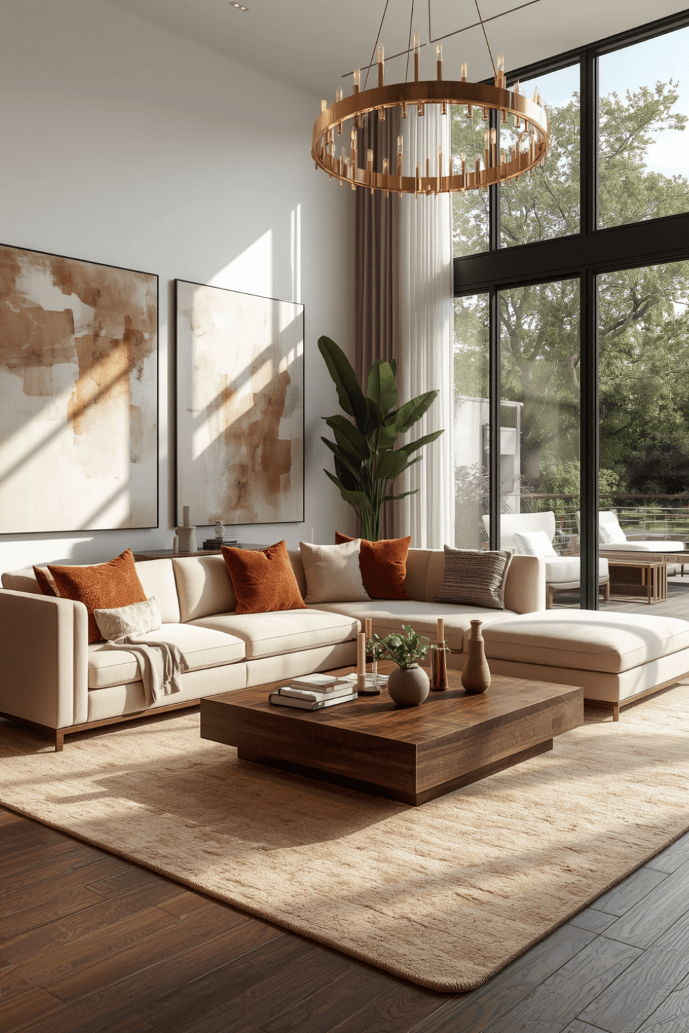
 They soften daylight without darkening the room, and the texture adds another layer without competing with your wall color.
5. Throw a Chunky Knit Blanket Over the Sofa
It’s a cheap way to add instant texture and coziness, and you can swap it out seasonally without touching anything permanent.
6. Use Woven Baskets for Storage
Baskets hide clutter and add texture at the same time, which is a rare two-for-one in living room styling.
7. Build a Gallery Wall With Mixed Frames
Combine wood and black frames on one wall for quiet contrast. Keep the mats consistent so it still reads as one cohesive grouping, not a random collection.
Real Mistakes I’d Skip Next Time
Buying everything in one shopping trip. I did this with my second attempt and ended up with a room that matched too perfectly and felt like a furniture showroom, not a home. Live with your base pieces for a few weeks before adding the rest.
Ignoring your flooring. I have warm oak floors, and my first “cool gray” everything scheme fought with them constantly. Work with your floor’s undertone, not against it.
Skimping on lighting layers. One overhead light in a neutral room is brutal. It flattens everything and makes the whole palette look washed out. I added a floor lamp and a couple of table lamps on warm bulbs (2700K, not the cold 5000K office kind) and the room instantly felt less like a rental unit.
Forgetting greenery. A plain neutral room without a single plant reads unfinished. Even a fake fiddle leaf fig or a snake plant from a local nursery adds a color and shape nothing else in the room has.
A Setup That Actually Worked
For what it’s worth, here’s roughly what’s in my living room now, three redos later: warm white walls (Sherwin-Williams Alabaster, tested at three times of day before I committed), a stone-gray linen sofa, a chunky jute rug, a black-framed mirror over the console, rattan side tables, and a mustard throw pillow I added almost as an accident that ended up being everyone’s favorite thing in the room.
That last part matters. A neutral room doesn’t mean zero color, ever. One small pop, whether it’s a pillow, a vase, or a single piece of art, keeps the whole thing from feeling like a hotel lobby.
Final Thoughts
Neutral doesn’t have to mean boring, and it definitely doesn’t mean “whatever beige was on sale.” It takes more planning than a bold color scheme, honestly, because there’s less room to hide behind a statement wall. Get the undertone right, mix your textures, add something dark to ground it, and let one unexpected color sneak in somewhere. That’s the difference between a room that looks like nobody lives there and one that actually feels like home.