Luxury Lavender Kitchen Ideas That Feel Elegant
Luxury Lavender Kitchen Ideas: What I Learned After My Cabinets Looked More Easter Than Elegant
I painted my kitchen cabinets a soft lavender because I wanted something unexpected and pretty, picturing a sophisticated, slightly moody space. What actually showed up on my walls read as distinctly sweet, almost Easter egg-like, especially paired with the polished chrome hardware I’d already installed. It felt more like a candy shop than the elevated kitchen I’d imagined.
It took some real trial and error with shade selection and hardware pairing before lavender finally worked the way I originally pictured. Here’s what I learned about the specific choices that separate a lavender kitchen that feels luxurious from one that reads as overly sweet.
Lavender Needs Very Specific Support to Read as Sophisticated
I underestimated how much lavender leans toward playful and delicate unless it’s paired with genuinely intentional supporting choices. Unlike some other colors that can carry a room more independently, lavender seems to need careful undertone selection and material pairing to avoid tipping into overly soft or juvenile territory.
Once I understood that lavender specifically required more deliberate styling decisions than colors like sage or navy might, my approach to fixing the kitchen changed completely.
My Mistake: Bright Lavender Paired With the Wrong Hardware and Countertop
My original lavender leaned bright and slightly cool, and I paired it with polished chrome hardware and a bright white countertop. That combination amplified the sweetness of the color rather than grounding it, creating a kitchen that felt more like a nursery than a sophisticated cooking space.
I repainted with a more muted, gray-leaning lavender, switched to matte black hardware, and replaced my countertop with a warmer, veined quartz. That combination completely shifted how the same general color read in the room.
Step-by-Step: Creating a Luxury Lavender Kitchen That Feels Elevated
1. Choose a muted, gray-leaning lavender over anything bright or pink-toned
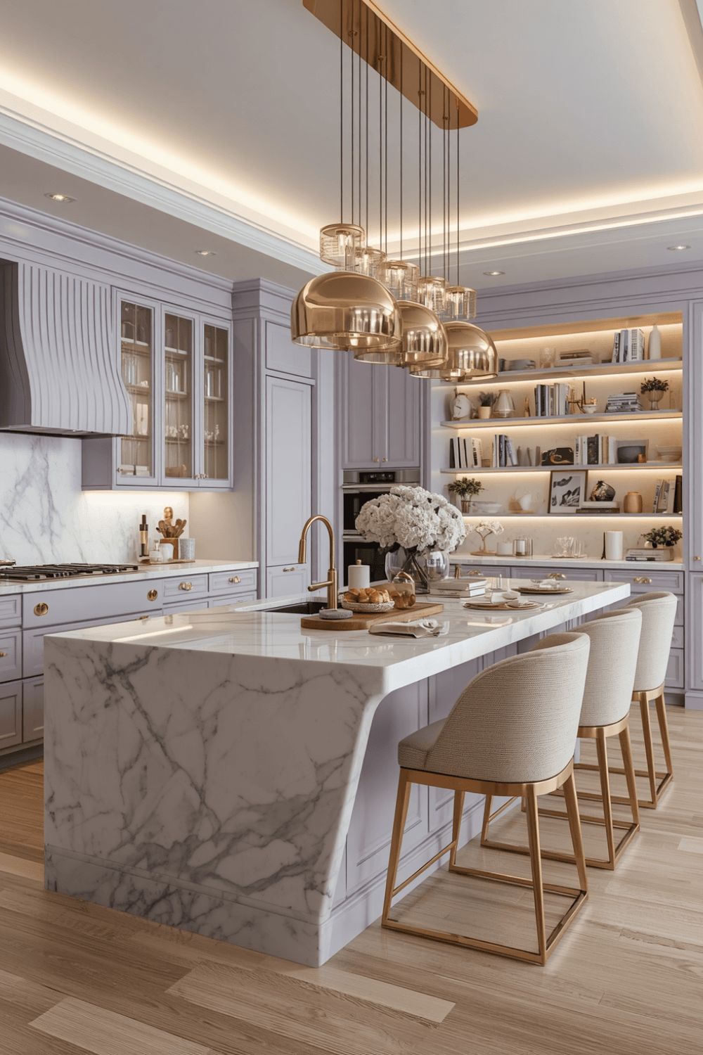 I now specifically look for lavender shades described as dusty, smoky, or gray-lavender rather than anything bright or leaning toward pink. These muted versions read as significantly more sophisticated regardless of what else is paired with them, while brighter lavenders need much more careful supporting choices.
2. Pair with matte black or aged brass hardware instead of polished metals
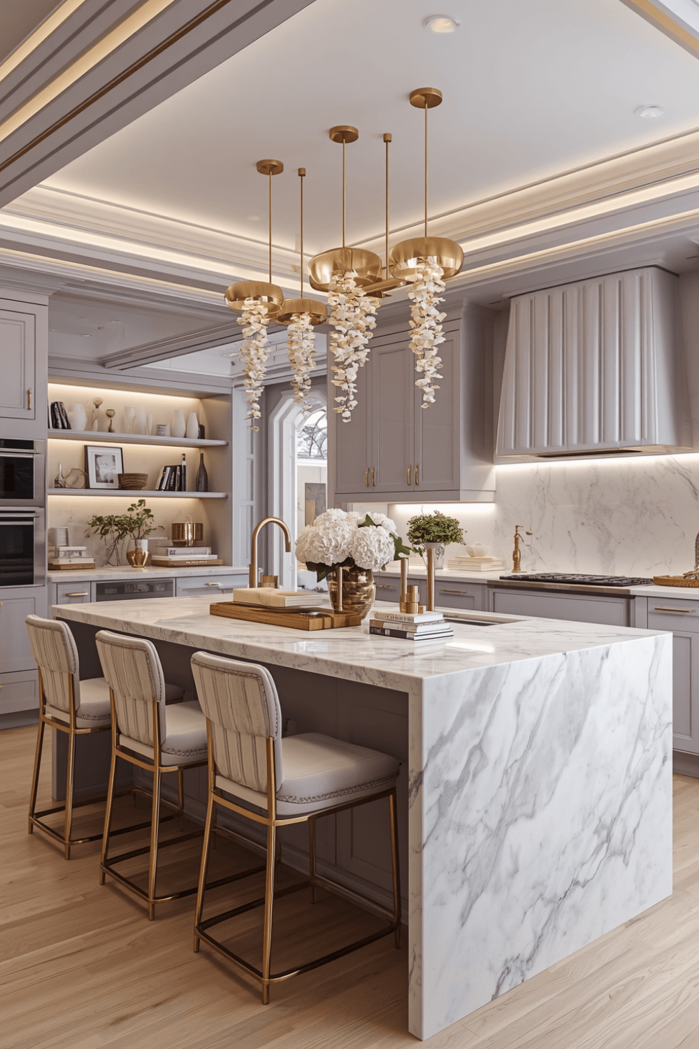 My original polished chrome amplified the brightness and sweetness of my lavender cabinets. Switching to matte black hardware grounded the color considerably, giving the kitchen a more intentional, editorial feel instead of the playful look my original pairing created.
3. Choose a warm, veined countertop instead of stark white
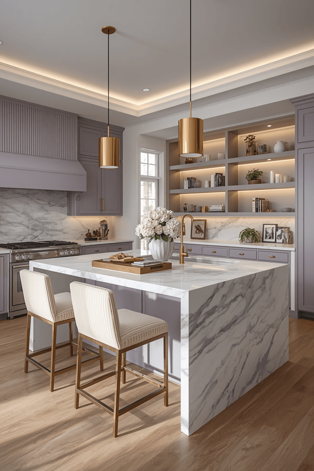 I replaced my original bright white countertop with a warmer quartz featuring subtle gray and gold veining, which balanced the cool undertones in my lavender far better than the stark white had. A countertop with some warmth and movement helps ground a cool pastel like lavender.
4. Add wood elements to warm up the overall palette
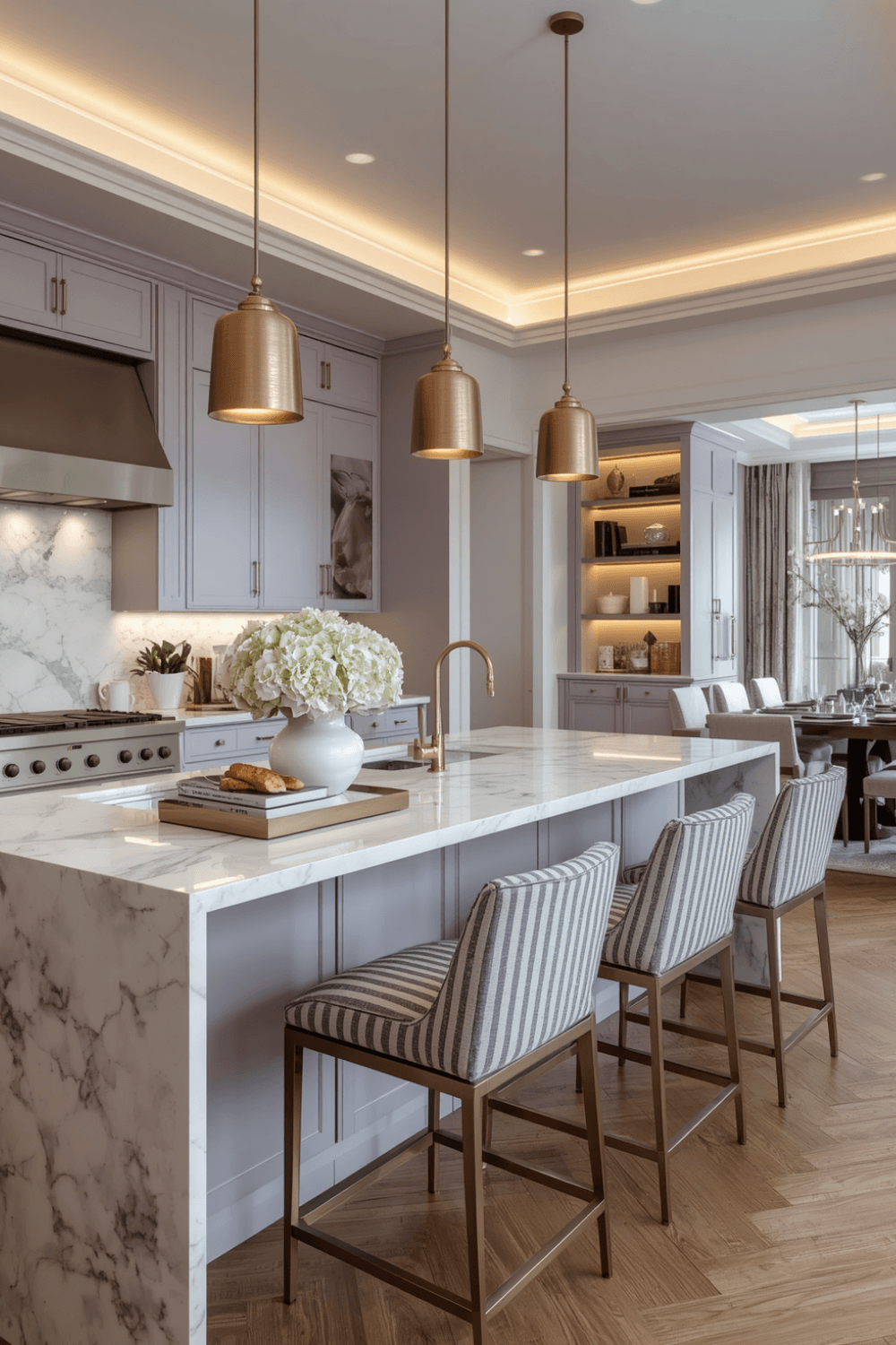 I added open wood shelving on one wall and a butcher block section of counter near my coffee station, both of which introduced warmth that pure lavender and white surfaces alone couldn’t provide. Wood tones seem to do particularly heavy lifting in balancing a cool pastel like lavender toward something more grounded.
5. Limit lavender to cabinetry, not every surface
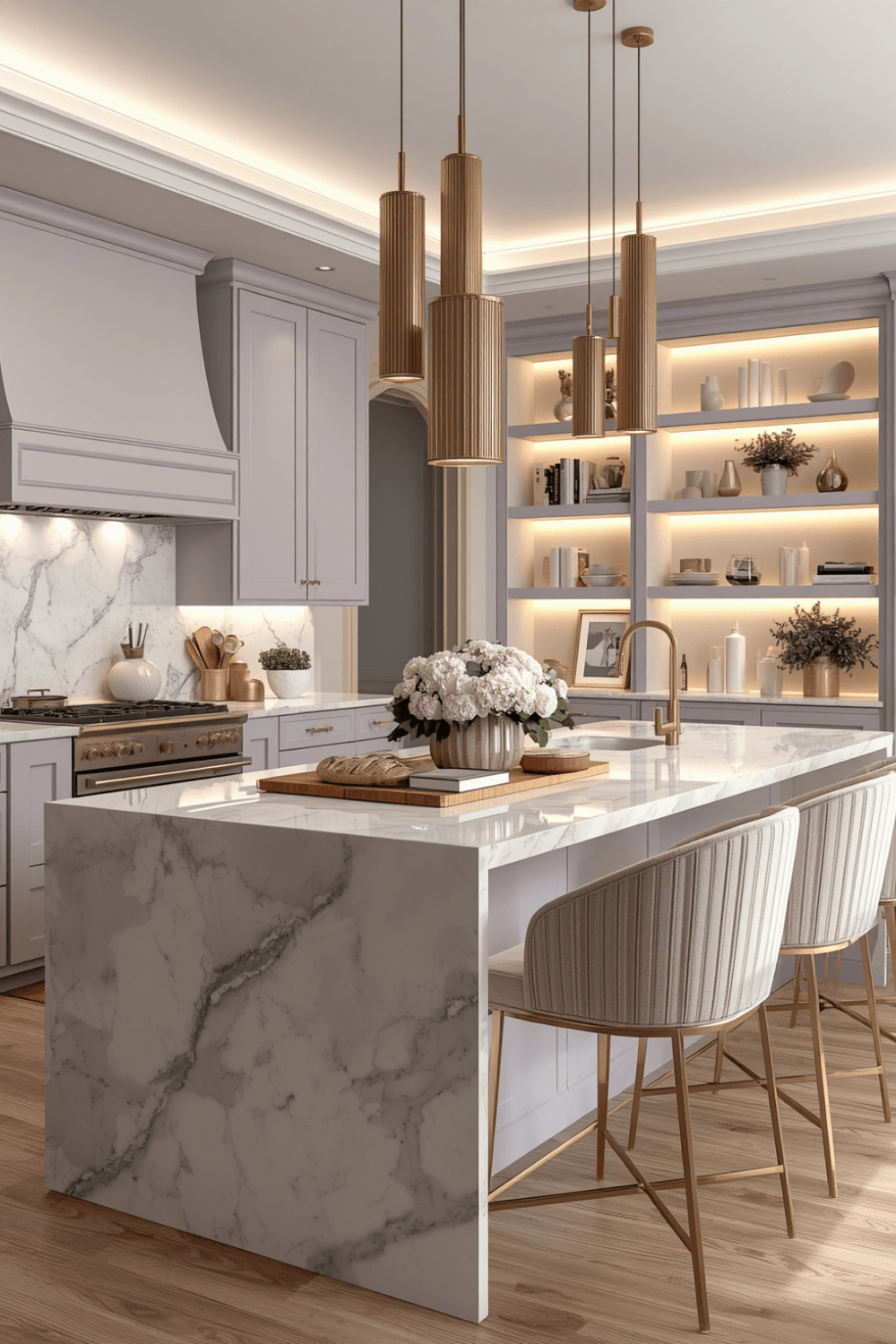 I kept my walls a warm cream rather than extending the lavender to every surface in the kitchen, which let the cabinets be the intentional statement rather than one part of an overwhelming, entirely purple room. Concentrating the color into fewer surfaces reads as more deliberate than covering everything in the same soft tone.
6. Use black or dark accents throughout for contrast
I added black pendant lights and a black-framed piece of art, which gave the kitchen structured, grounded moments against all that softness. That contrast is genuinely what kept the space from tipping fully into delicate, pastel-heavy territory the way my original attempt had.
7. Test your specific lavender against your existing metal and stone choices
I brought my new paint sample and held it against my countertop and hardware options before finalizing anything, since lavender’s cool undertones can clash with certain metals and stones in ways that aren’t always obvious from separate samples alone. This step caught a potential mismatch before another expensive repaint.
Real Examples From People I Know
A friend used an extremely muted, almost greige-leaning lavender on just her kitchen island, keeping her perimeter cabinets a simple white. The subtlety of that specific shade, combined with limiting it to one piece, reads as genuinely sophisticated rather than overtly purple or sweet.
Another friend went bolder with a deeper, more saturated lavender throughout her whole kitchen, but balanced it extensively with black hardware, black window frames, and a dark countertop. The heavy contrast throughout kept her bolder color choice from tipping into anything resembling a nursery palette.
Common Mistakes to Avoid
Choosing a bright, pink-leaning lavender instead of a muted, gray-leaning one. Brighter versions need far more careful supporting choices to avoid reading as overly sweet.
Pairing lavender with polished, bright metals. That combination tends to amplify the color’s softness rather than grounding it into something more sophisticated.
Using a stark white countertop with cool-toned lavender cabinets. A warmer, veined stone generally balances lavender’s cool undertones more successfully.
Extending lavender to every surface in the kitchen. Concentrating the color into cabinetry alone tends to read as more intentional than an entirely purple room.
Skipping dark or structured contrast elements. Black or dark accents genuinely help ground a soft color like lavender and keep it from feeling too delicate.
Final Thoughts
My lavender kitchen taught me that this particular color needs more deliberate supporting choices than some others to actually read as elevated rather than sweet. The shade change alone, from bright to muted and gray-leaning, combined with the hardware and countertop swaps, completely transformed how the same basic color idea worked in the space.
If you’re considering lavender for your own kitchen, lean toward a muted, gray-leaning shade, pair it with matte black or aged brass hardware, and add plenty of warm wood and dark contrast elements throughout. That combination is really what separates a genuinely luxurious lavender kitchen from one that ends up feeling more Easter than elegant.