Luxury Pink Wardrobe Design | Modern Dressing Table & Bedroom Storage Ideas
Luxury Pink Wardrobe Design: What I Learned After Mine Looked Cheap Instead of Chic
I painted my built-in wardrobe doors a bright bubblegum pink, picturing something glamorous straight out of a dressing room in a fashion magazine spread. Once it was finished, it looked more like a candy store display than the elegant, luxury closet I’d been imagining. The shade was too saturated, too playful, and it clashed badly with the gold hardware I’d already installed.
It took a repaint and a genuinely different approach to the whole design before that same wardrobe finally read as luxurious instead of overly sweet. Here’s what I learned about the real difference between a pink wardrobe that looks chic and one that looks like it belongs in a kids’ room.
Luxury Pink Requires a Completely Different Shade Than Playful Pink
My original mistake was choosing a bright, saturated pink because it felt fun and bold on the paint chip. What actually reads as luxurious is a much more muted, dusty pink, closer to a blush or mauve tone than anything close to bubblegum or hot pink. That shift in undertone changes the entire feeling of the piece.
Once I understood that distinction, repainting with a more sophisticated shade completely changed how the wardrobe read, without changing anything else about the design.
My Mistake: Bright Pink Paired With the Wrong Hardware
Beyond the color itself, my original bright pink clashed badly with the polished gold hardware I’d chosen, which made the whole thing look garish rather than elegant. Bright, saturated colors need careful hardware pairing, and gold against bubblegum pink pushed the whole look further into playful territory instead of sophisticated.
I repainted the doors a muted dusty rose and switched to a slightly warmer, matte brass finish for the hardware instead of the polished, shinier gold. That combination read as intentional and elegant in a way my original pairing never managed.
Step-by-Step: Designing a Luxury Pink Wardrobe That Actually Feels Elevated
1. Choose a muted, dusty shade over anything bright or saturated
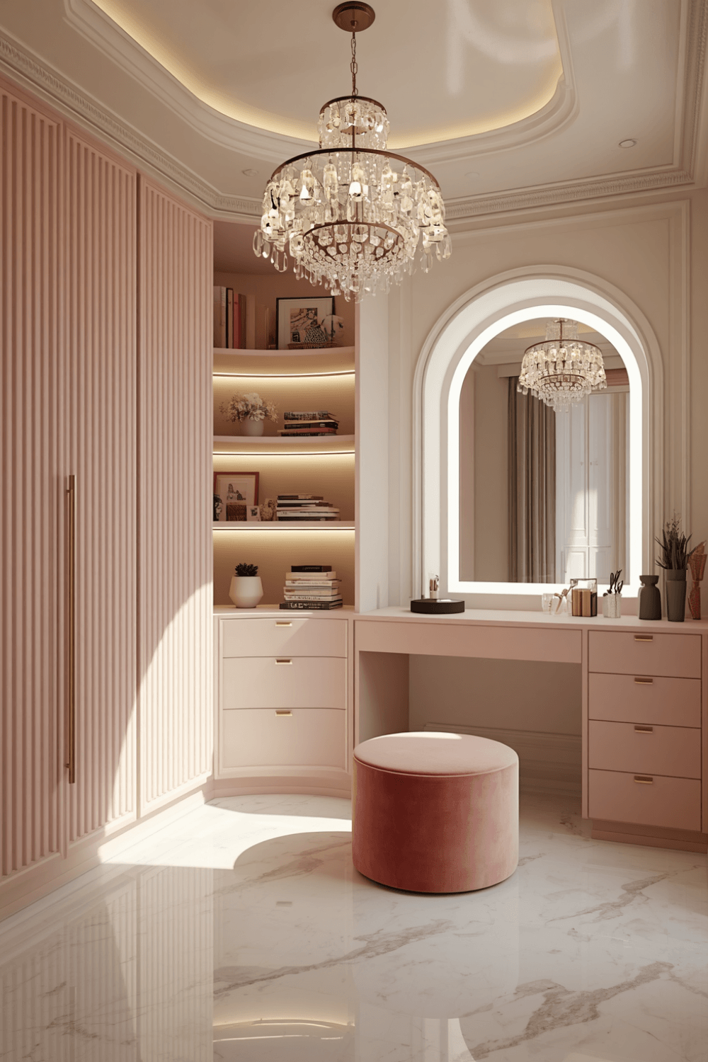 I now specifically look for pink shades described as dusty rose, mauve, or blush rather than anything labeled bubblegum, hot pink, or coral. These muted tones read as sophisticated regardless of the finish or hardware paired with them, while brighter shades need much more careful supporting choices to avoid looking playful.
2. Match your hardware finish to the pink’s undertone
My dusty rose has cool undertones, so I chose a slightly warmer matte brass instead of a cooler polished gold, which balanced rather than competed with the paint color. If your specific pink leans warmer, a cooler silver or chrome finish might actually be the better pairing instead.
3. Add texture through the door design itself, not just color
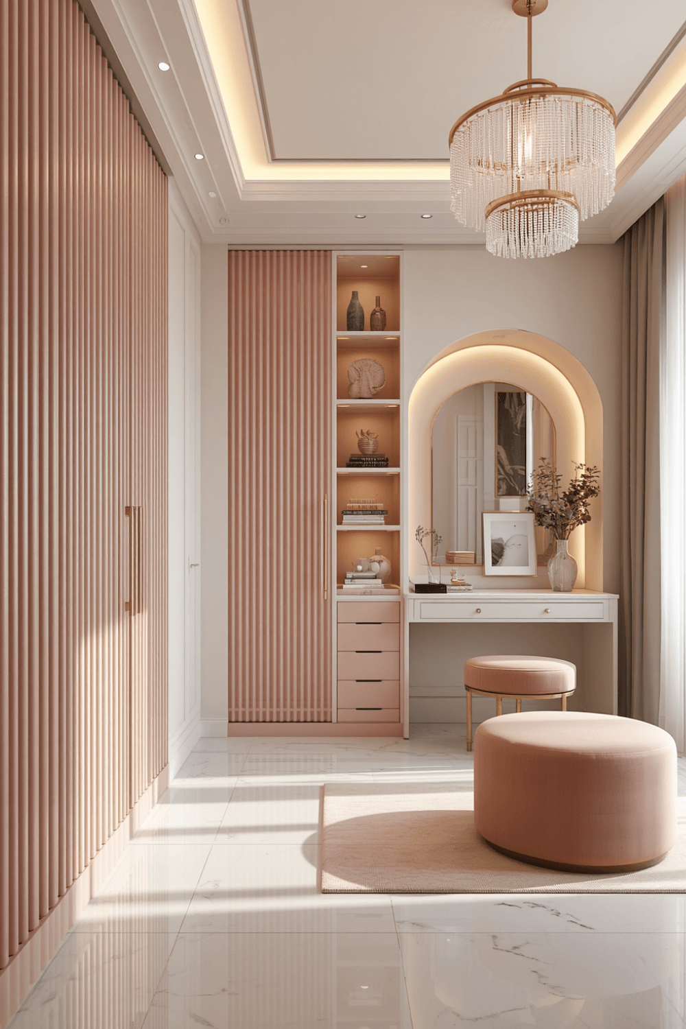 I added fluted paneling to my wardrobe doors instead of leaving them flat, which gave the piece dimension and visual interest beyond just the paint color alone. That added texture reads as more custom and luxurious than a flat door in the same shade would on its own.
4. Use a matte or satin finish rather than high gloss
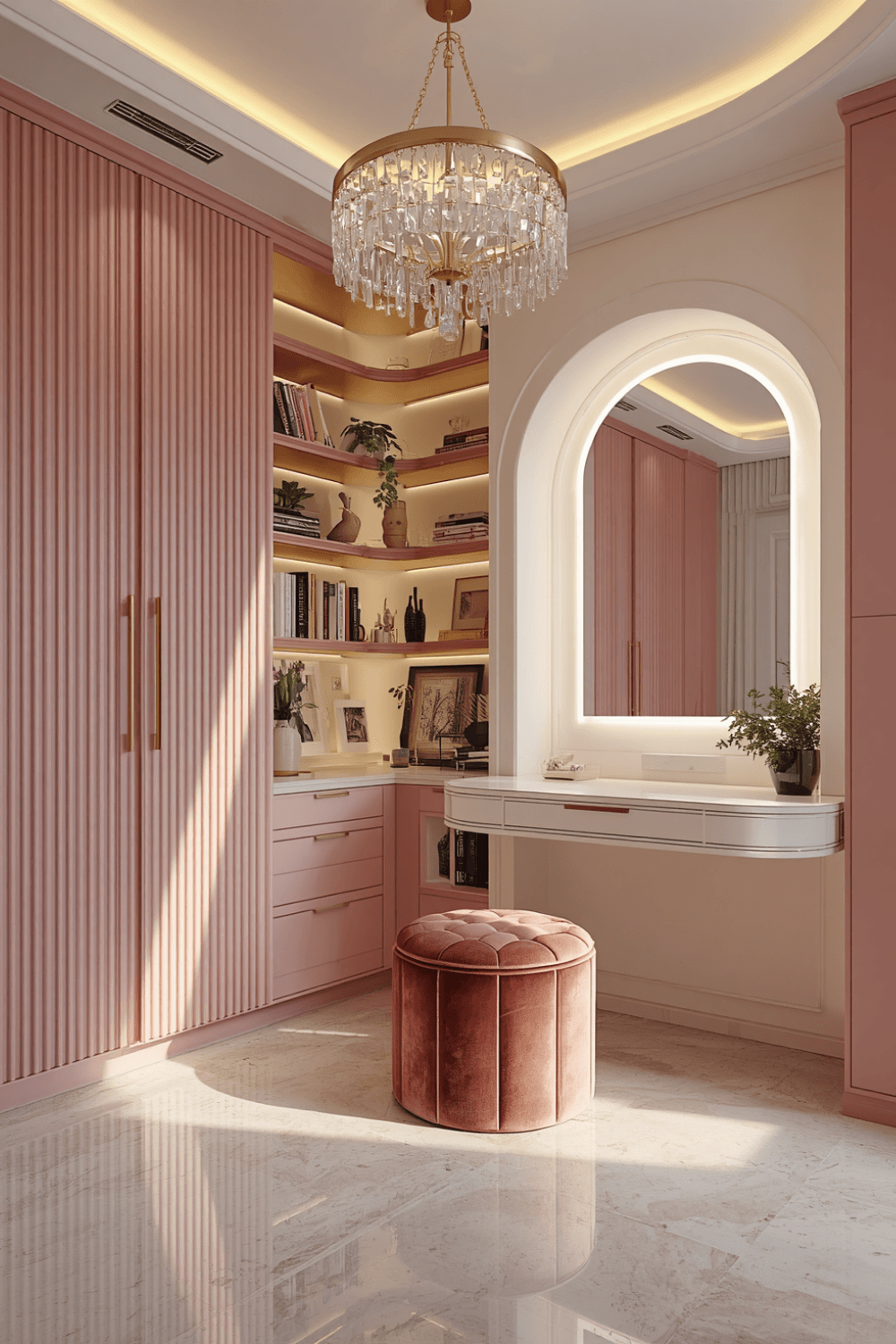 My original high gloss finish amplified how bright and almost plastic-looking the bubblegum pink appeared. Switching to a matte finish on my repaint softened the whole look considerably, giving it a more sophisticated, almost velvety appearance rather than a shiny, toy-like one.
5. Balance the pink with plenty of neutral surrounding elements
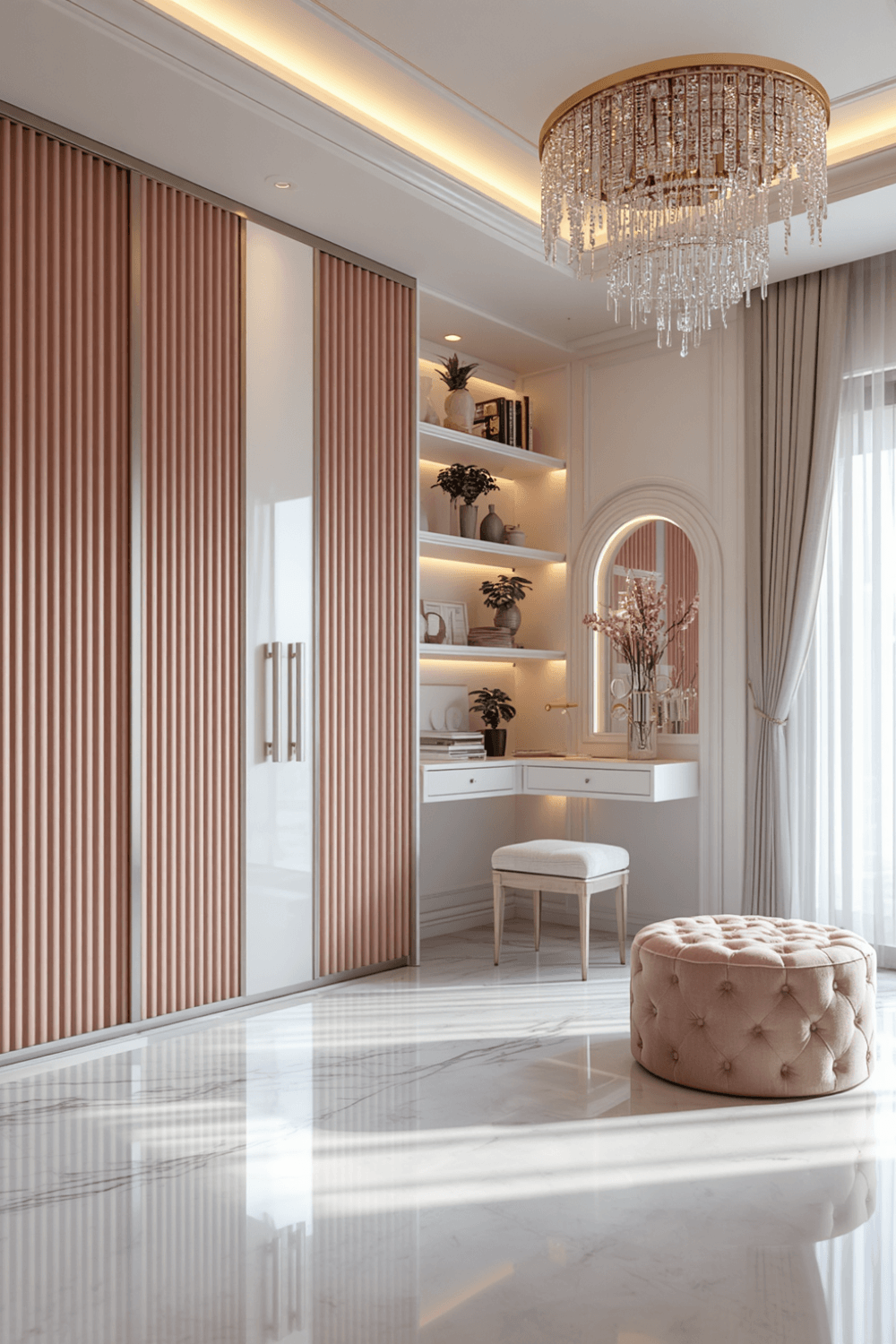 I kept my walls and flooring in warm neutrals, cream walls and a light wood floor, which let the wardrobe be the intentional pop of color rather than competing with an equally bold room around it. Too much additional color elsewhere can push a pink wardrobe from elegant statement piece into overwhelming.
6. Add interior lighting to elevate the overall feel
I installed warm LED strip lighting inside the wardrobe, which genuinely elevated the whole experience of opening it every day. That detail alone added a level of luxury that the exterior color and hardware choices couldn’t achieve by themselves.
7. Layer in a complementary material like marble or brass accents nearby
I added a small marble-top vanity stool near the wardrobe and kept my door handles in that same matte brass, which tied the whole area together as one cohesive, elevated vignette rather than an isolated pink piece of furniture sitting on its own.
Real Examples From People I Know
A friend chose an extremely muted, almost greige-leaning dusty pink for her wardrobe, paired with simple black hardware instead of any metallic finish. The combination reads as genuinely sophisticated and almost gender-neutral despite technically being a pink piece, which she says surprises people who assume pink automatically means overtly feminine.
Another friend went bolder with a deeper rose tone but balanced it with extensive black and brass detailing throughout, plus a high-gloss lacquer finish that actually worked in her case because the deeper, richer shade could handle that shine without looking childish the way my original bright pink did.
Common Mistakes to Avoid
Choosing a bright, saturated pink instead of a muted, dusty shade. Bright pinks need far more careful supporting choices to avoid reading as playful rather than luxurious.
Pairing bright pink with polished gold hardware. That combination tends to push the whole design further into candy-colored territory rather than sophisticated.
Using a high gloss finish on a bright pink shade. It amplifies the color’s intensity in a way that can look plastic or toy-like rather than elevated.
Surrounding the wardrobe with equally bold colors elsewhere in the room. Too much competing color can overwhelm what should be an intentional statement piece.
Skipping interior lighting and texture details. These small additions do significant work in elevating the overall feel beyond what color and hardware alone can achieve.
Final Thoughts
My pink wardrobe taught me that the difference between chic and childish really comes down to shade selection and how carefully everything else supports that color, not whether pink itself can look luxurious. The repaint to a muted dusty rose, combined with the hardware and finish changes, completely transformed how the same basic piece read in the room.
If you’re designing your own pink wardrobe, lean toward muted, dusty shades over anything bright, match your hardware finish carefully to the paint’s undertone, and don’t skip small details like interior lighting and texture. That combination is really what separates a luxury pink wardrobe from one that reads as more playful than polished.