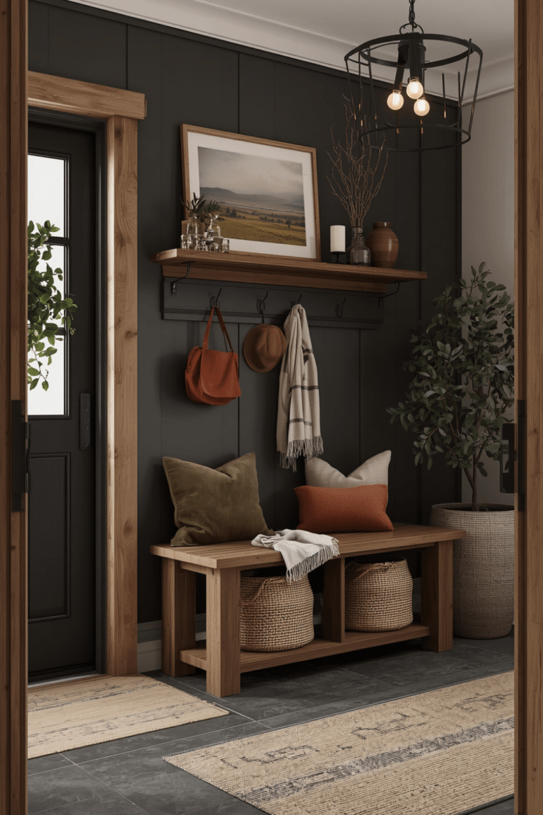
Hallway Decor Ideas That Actually Work (Real Tips)
Hallway Decor Ideas: What I Learned Filling a Long, Awkward Empty Space
For the first year in my house, my main hallway was just bare white walls and a single overhead light that made the whole stretch feel more like an office corridor than part of a home. It’s a long, narrow space connecting three bedrooms, and I genuinely avoided decorating it for way too long because it felt like an awkward, forgettable in-between area.
Once I finally tackled it, my first attempt at a gallery wall was uneven, poorly spaced, and honestly looked more chaotic than curated. It took a full redo with an actual plan before that hallway stopped feeling like leftover space and started feeling like part of the house people actually notice. Here’s what I picked up along the way.
Hallways Get Ignored, But They Shouldn’t
I think most people treat hallways the same way I did — as pure function, a space you just walk through to get somewhere else. But it’s often one of the most-walked spaces in the whole house, which honestly makes it worth just as much design attention as any actual room.
Once I started treating my hallway like a real design opportunity instead of dead space between rooms, the whole house started feeling more cohesive, not just that one stretch of wall.
My Gallery Wall Disaster (And What Fixed It)
My first attempt hung frames directly on the wall with a hammer and nail, eyeballing the spacing as I went. The result was uneven gaps, frames at slightly different heights, and one crooked piece I somehow never noticed until a guest pointed it out months later.
I ended up taking everything down and starting over using paper templates taped to the wall first, which let me move things around and perfect the spacing before putting a single nail hole in the wall. That one change made the entire redo look intentional instead of thrown together.
Step-by-Step: Decorating a Hallway That Actually Works
1. Plan your gallery wall with paper templates first
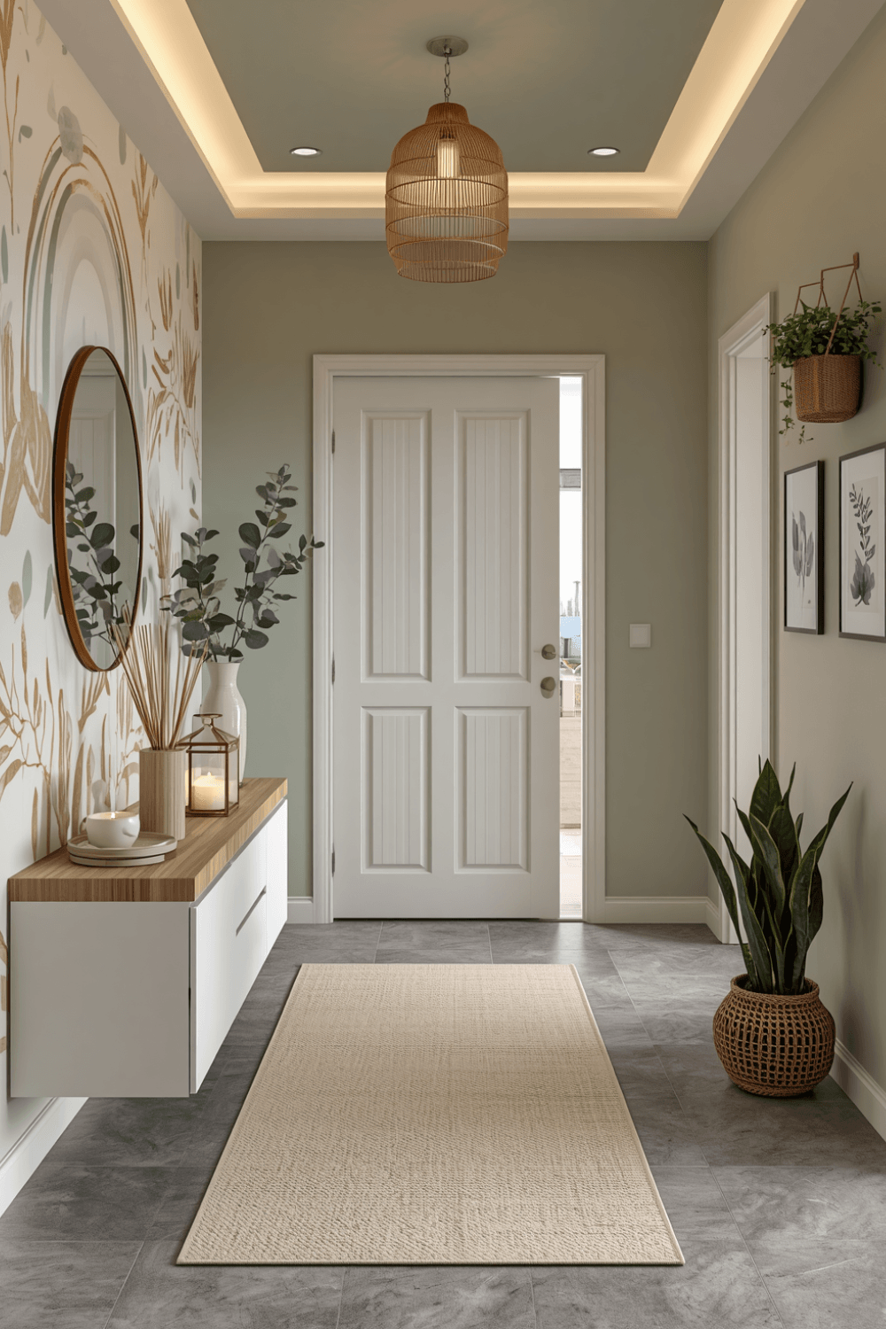
I traced each frame onto kraft paper, cut them out, and taped the paper templates to the wall in different arrangements before committing to anything permanent. It let me actually see the spacing and adjust it as many times as needed without extra nail holes.
2. Keep a consistent gap between frames
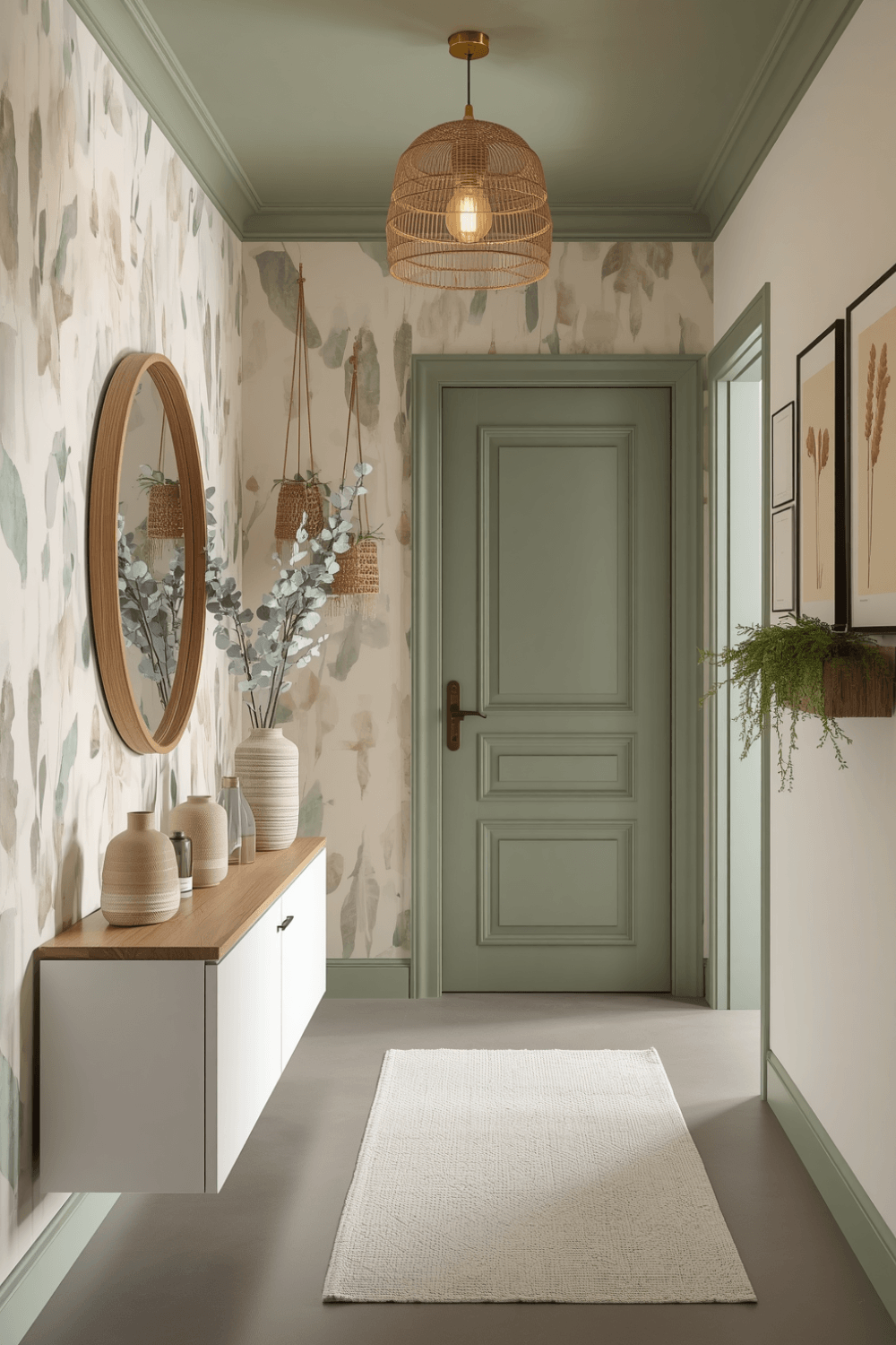
I settled on roughly 2 to 3 inches of spacing between each frame throughout my gallery wall, which kept everything feeling cohesive instead of randomly scattered. Consistency in spacing matters more than people expect for making a gallery wall look planned.
3. Add lighting beyond the single overhead fixture
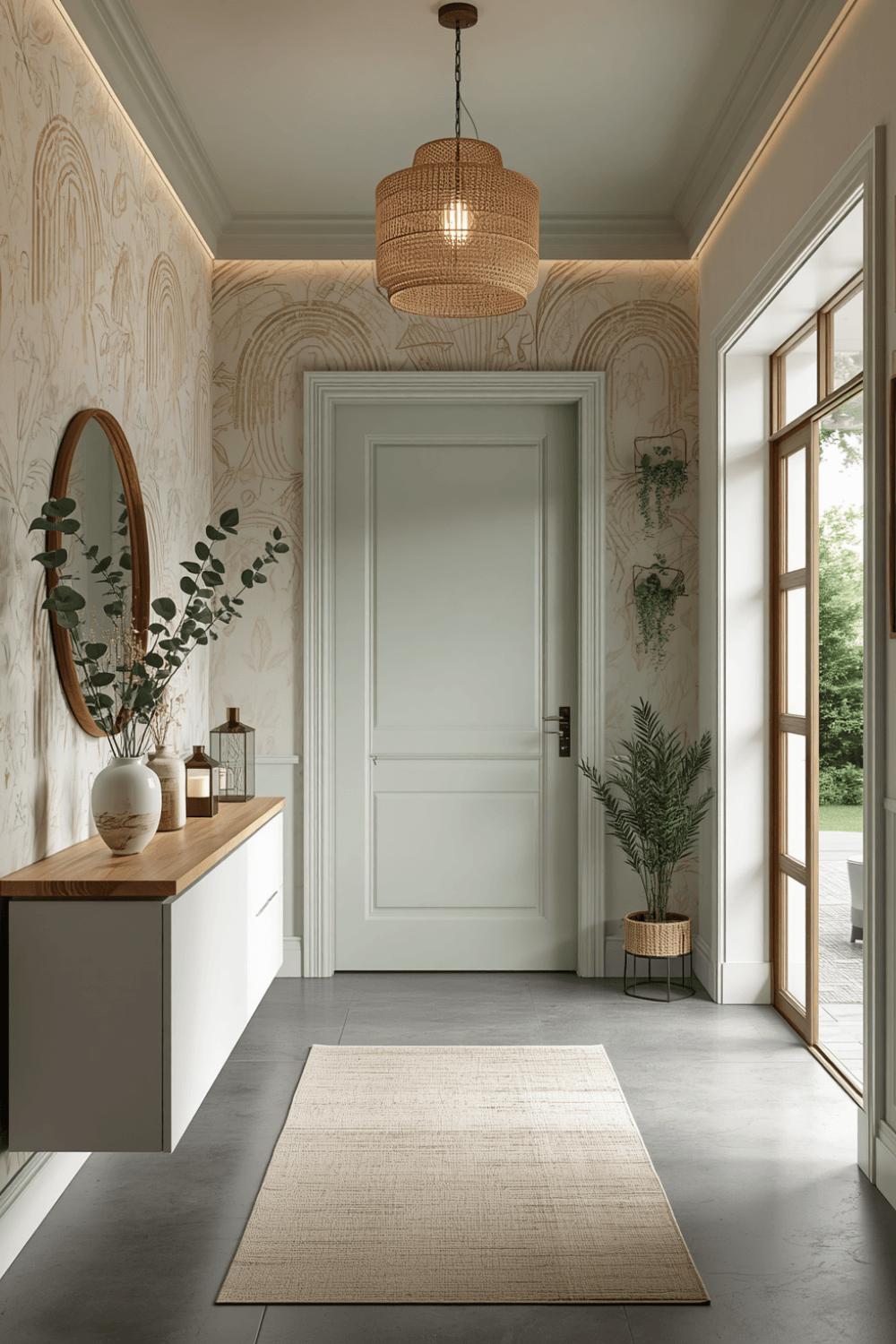
My hallway had one centered ceiling light that left the ends of the hallway noticeably dimmer than the middle. I added a couple of small wall sconces spaced along the length of the hall, and it evened out the lighting significantly while adding a warmer, more layered feel.
4. Use a runner rug to add warmth and define the space
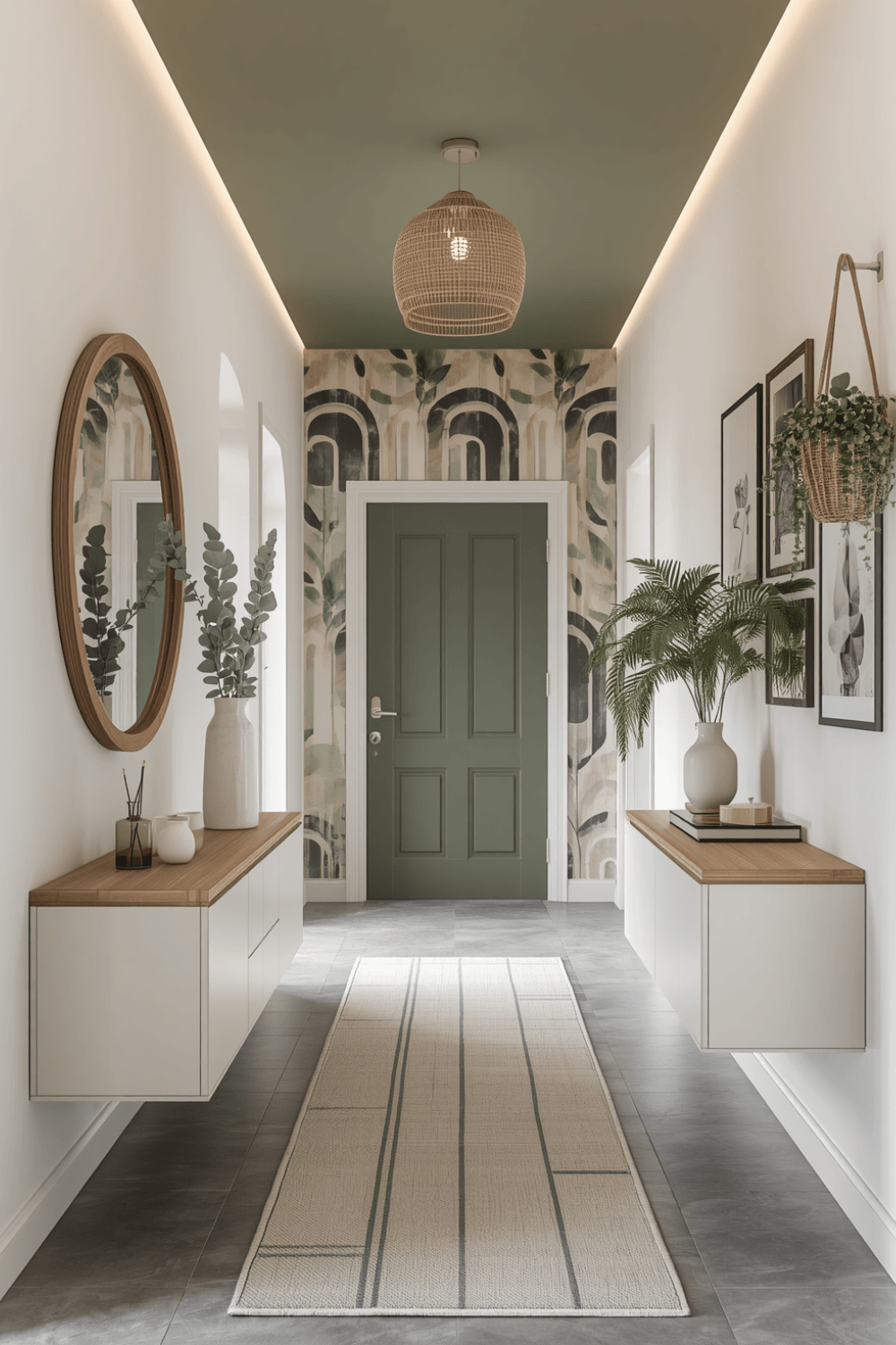
I added a long runner rug down the center of the hallway, which immediately made the space feel more finished and less like bare hard flooring stretching between rooms. It also helps with noise since hallways tend to echo more than other rooms.
5. Mix photos, art, and mirrors instead of only frames
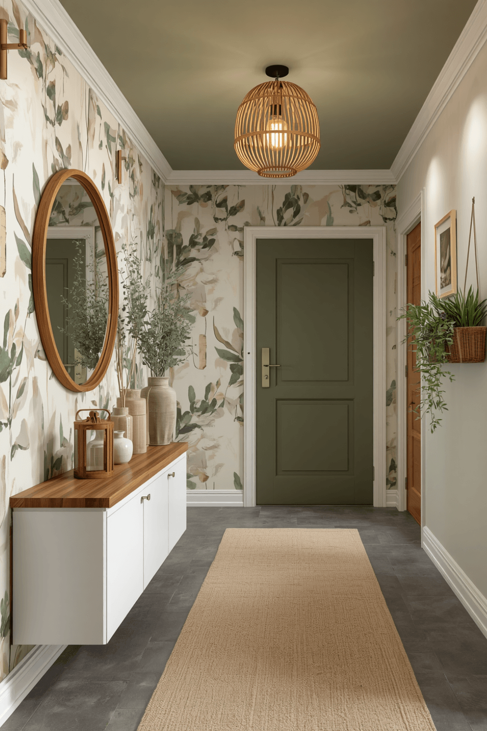
My redo mixed in a small mirror and one textured piece alongside framed photos and prints, instead of using only flat frames throughout. That mix of textures and reflective surfaces kept the wall from feeling monotonous and added a bit of extra light bounce down the hallway.
6. Consider a bold paint color if the hallway lacks natural light
I painted my hallway a slightly deeper warm tone than my adjoining rooms, since hallways often don’t get direct natural light and can handle more saturated color without feeling overwhelming the way a main living space might. It gave the space its own identity instead of just blending into the surrounding rooms.
7. Add a small functional touch if you have any wall space to spare
I mounted a narrow floating shelf about halfway down my hallway just wide enough for a small vase or a stack of books. It’s a small addition, but it broke up the long stretch of wall and gave the space one more layer of personality beyond just the gallery wall.
Real Examples From People I Know
A friend with a shorter hallway skipped the gallery wall approach entirely and used a single oversized art piece instead, paired with one small console table underneath. It made a big visual statement without needing to plan out multiple smaller frames and their spacing.
Another friend transformed a long, dark hallway using a combination of wallpaper on just the lower half of the wall paired with picture frame molding above it, plus warm sconce lighting throughout. It gave the hallway a distinct, intentional identity instead of blending in as an afterthought space between rooms.
Common Mistakes to Avoid
Hanging a gallery wall without planning spacing first. This alone caused my entire original hallway redo to look uneven and unintentional.
Relying on a single overhead light for a long stretch of hallway. It tends to leave the ends noticeably dimmer than the middle of the space.
Skipping a runner rug on hard flooring. It adds warmth, helps with noise, and makes the space feel more finished.
Using only flat frames throughout a gallery wall. Mixing in mirrors or textured pieces adds visual interest that flat frames alone can’t provide.
Treating the hallway as an afterthought space with no real design plan. It’s often one of the most-walked areas in the house and deserves the same intention as any other room.
Final Thoughts
My hallway went from an ignored, forgettable stretch of wall to genuinely one of the spaces I enjoy walking through most in my house, and the fix came down to actual planning instead of eyeballing everything as I went. The paper template trick alone saved my second gallery wall attempt from becoming a third redo.
If you’re working on your own hallway, plan your gallery wall spacing before hanging anything permanent, layer in lighting beyond a single overhead fixture, and don’t underestimate what a runner rug can do for a space that often gets overlooked. That combination is really what made mine finally feel like part of the house instead of leftover space between rooms.